In the third week, we looked at augmented reality (AR) – while VR replaces the world around you with a different, virtual world, AR places virtual elements over the top of reality. The most well known example of this is Pokemon Go, where the Pokemon could be overlayed onto the camera, as if they were appearing in the real world.
One very important factor of augmented reality, especially more advanced forms, is making it seem more realistic by having the virtual objects fit into the environment. This is called occlusion – being able to hide the objects behind real things. Without it, the virtual objects would simply appear in front of everything else.
Other uses of AR technology could include medical training, by being able to view a human body in a 3D, more realistic environment; maintenance, where experts can view things without having to physically be there to try to diagnose issues; or interior design, by being able to view possible changes to a space and get an idea of what things could look like in advance.
There are various different ways of setting up augmented reality. One option is using Light Detection and Ranging (LIDAR) to view the environment, which can help with occlusion by detecting depth. A simpler way is marker-based AR. This uses an image as a marker, which acts as a reference point for the virtual object’s location.
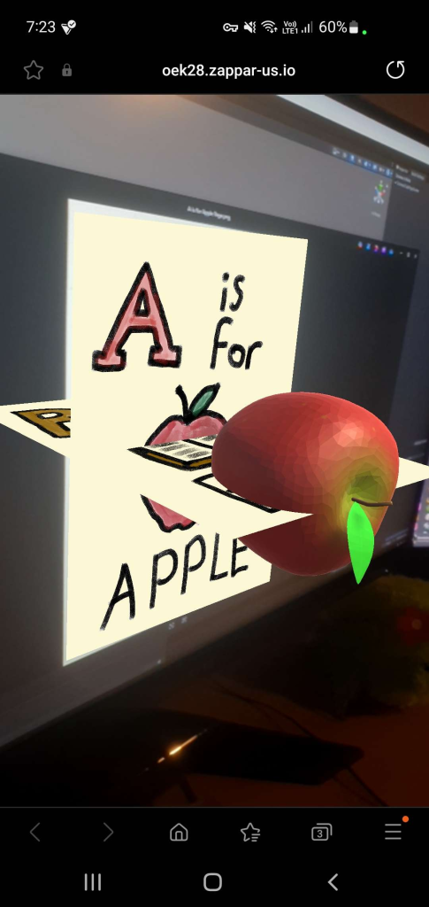
In the workshop, we looked at an AR platform called ZapWorks, which, in combination with Unity, can be used to create marker based AR experiences. It is activated by scanning a QR code, which takes the user to a special camera. When that camera detects the specified image, it will display the 3d object linked to that image.
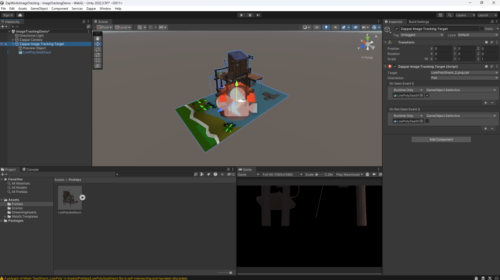
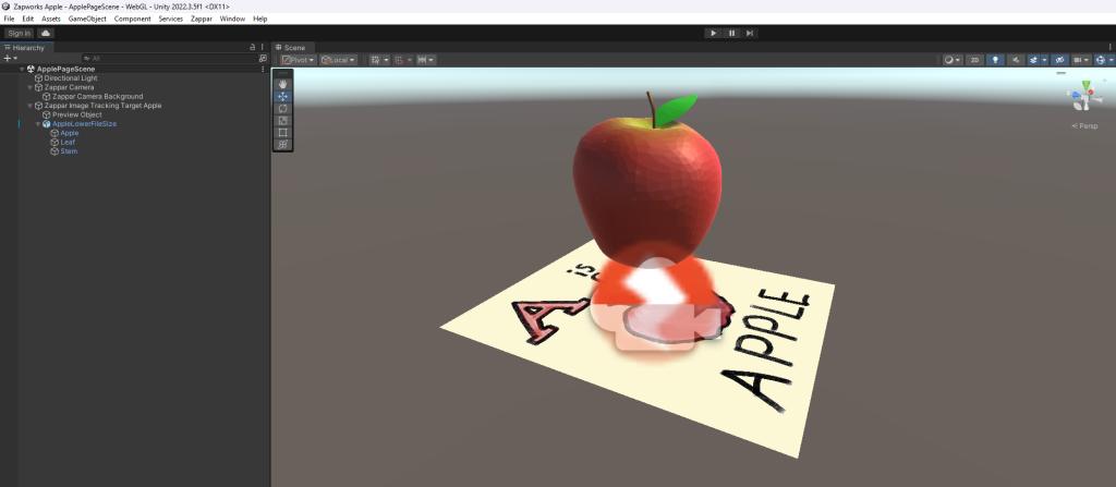
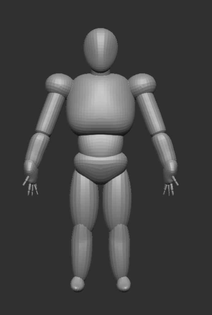
I decided to use the provided image and model to try out ZapWorks. To make it work, I had to add the Zappar addon to Unity. This allowed me to add a Zappar Camera and a Zappar Image Tracking Target. The image marker was added to the Image Tracking Target, and the model was placed into the scene and set to inactive. In the Image Tracking Target, I set the model to be activated on Seen event, and disactivated on Not Seen event.
Once the Unity project is built and uploaded to ZapWorks, a QR code is provided. When scanned, it leads to a website with an AR camera. When the camera sees the provided image, it will display the 3D model over it, in the position it was placed in the Unity project.
Overall, I find the idea of using AR quite interesting – I feel like there are a few different ways I could take this further, and am interested in exploring the different uses.
This week, we looked at the uses of virtual reality technology in creating art. We focused on looking at and trying out four different softwares. Unfortunately, due to some issues with the headsets, as well as feeling nauseous, I did not get to spend much time in virtual reality myself, so I focused on watching the others and considering the uses of the different softwares.
The first software we used was Open Brush. It allows you to use the VR controls to paint in 3D space. It seemed very easy to use, while providing a lot of use in being able to quickly sketch out and design 3D environments.
Next was Gravity Sketch. This allows for quick sculpting in VR, with various features allowing for collaboration between different people and teams. This seems quite effective for making models in VR, and could have a few unique advantages over regular 3D modelling once the user adjusts to the different environment.
ShapesXR is a tool that can be used to block out 3D environments and areas. Similar to Open Brush, it is useful for creating a quick design for a 3D environment, to help visualise and try out different ideas and elements.
Finally, the last software was Adobe Aero. This is a software that is designed to create AR technology, with a focus on mobile platforms. I did not get to see much of this software, but it seemed very interesting to try out.
While virtual reality art is very unique and offers a lot of different ways of using it, I didn’t think I could take it very far in a project, especially considering I struggled with nausea after only briefly trying the VR headsets. If I was more used to being in VR, it would be more interesting of an option to me.
After looking at the different ideas and options over the last few weeks, I decided that I wanted to do my project using Augmented Reality. I found it the most interesting of the options, and had a few ideas that I felt would be suitable for my project.
Augmented Reality Research
To begin researching, I wanted to look at various different kinds of AR technology, and how they are used, as I felt this could inspire my own project.
The main kind of AR technology I looked into was marker based AR, as the website for using AR that we looked into during the module used this form of AR. For marker based AR, the augmented object is activated when the user scans a designated “marker”, such as an image or pattern that is distinct and can be recognised by the camera. This is quite a stable and reliable form of AR, which gives it a higher level of quality than some other kinds, but it requires the camera to look at the specific marker, which can be quite restrictive in various situations.
Markerless AR, on the other hand, does not require a marker, and simply places the virtual object into the real world. Often, when used, the software will ask the user to find a flat surface to display the model on, to make it slightly more grounded and fit better into the space. A good example of markerless AR is Pokemon GO, which displays a virtual pokemon overlayed on the camera to make it appear like it is in the world.
Concept
The idea I want to work on for my project is a proof of concept of an augmented reality picture book for children. By scanning a QR code at the start of the book, the camera can then be used to scan various images in the book, and create a 3D virtual object over them.
I felt like this would be a very interesting application of AR technology. As the picture book is for children, the goal is to try to create something quite colourful and appealing, in order to engage and entertain them. This is something that is easily achievable with a regular picture book, but I believe that by adding AR, it will enhance these ideas, while also making it even more engaging by adding interactivity. The marker based AR system I plan to use will be effective for this, as it provides a stable view of the model, and the limitations will not cause problems as the markers will be built in to the picture book.
Another option would be to try to create something using VR, which would be even more interactive and perhaps make it more exciting to use. However, there are a few reasons why I felt that AR would work better. Firstly, as the product is for younger children, it could be used in an educational setting, where multiple children could view it together. To do this in VR would involve moving a VR headset around to everyone involved, which would be quite time consuming and inconvenient. whereas AR simply needs a single device such as a phone or an iPad, which is much easier to pass between multiple people. Additionally, VR headsets could lead to motion sickness and other issues, which are avoided by AR.
Ethical Considerations
In a product aimed at younger children, there are often ethical considerations to consider. One thing that I felt was important to think about with this project was the effect of exposure to screens on children. Designing a screen-based product or idea for younger audience could lead to an increased dependency and reliance on screens, which may have negative effects on their development and lead to problems later in life.
However, I believe this project will not cause these issues, and that it is overall positive. Firstly, my idea is educational, which will provide benefits to the younger audience. It is also non-addictive, and will only be used for short amounts of time, likely in a group setting. This reduces the negative impacts of exposure to screens, while retaining the positive benefits of increased engagement and interest. It could also help to raise tech literacy among the young children, which is an important skill to develop as technology has become a very large part of modern life, so having a basic knowledge of and ability to use it early could be very helpful.
Ideas and Development
The first idea I had was for a story based on “The Very Hungry Caterpillar.” This would involve having a model for each different food, which would show when that food was scanned with the camera. However, while this did seem interesting, I felt that it would be a little too complicated to create my own original picture book story, especially as a proof of concept. I decided that it would be better for the project if I used a simpler picture book, and focused much more on showing off the AR elements and ideas instead of the book itself.
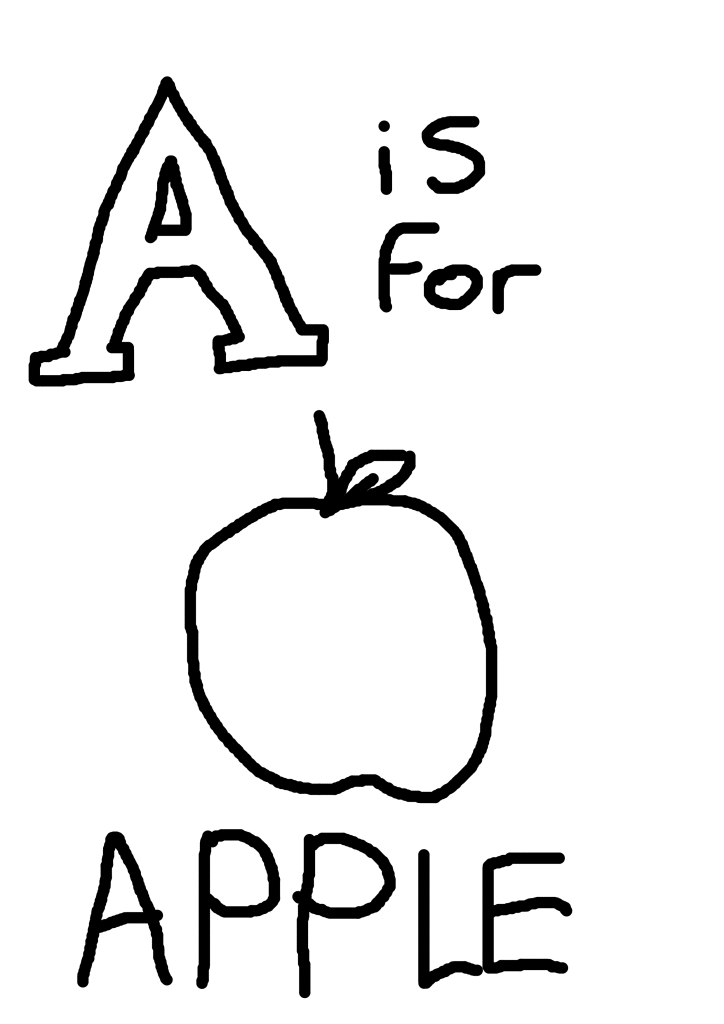
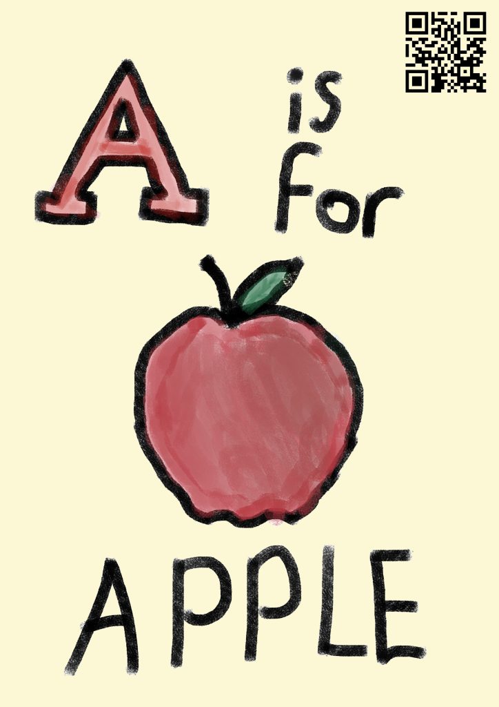
Instead, I decided to do an ABCs style book, where each page has a letter of the alphabet, along with an object that starts with that respective letter – for example, “A is for Apple”. This is quite a common theme for educating younger children on the alphabet, so I knew the concept for the picture book was a functional and reasonable idea to use. This should be a good mixture of an engaging but simple book for younger children, while also showing off the potential of the AR technology and how it can be integrated quite effectively.
The overall goal is to create a product that can help children with literacy through an engaging and fun activity. This should help to make the children more interested in learning, and hopefully improve their retention of the things they read.
As I am trying to make a proof of concept for the idea, I decided that creating a full 26-page book with a page for every letter would be excessive, and likely reduce the quality of each model and page due to the quantity I would need to create. Instead, I felt that by creating just the first 5 pages (A-E), I could get a nice mixture of slightly higher quality models, while still showing enough variety and quantity of pages to make the proof of concept viable and letting me explore its potential.
To begin the planning stage of my project, I first spent some time deciding on what the objects would be for each of the five pages. These needed to be objects starting with the letters A-E respectively, and be both simple enough for younger children to know and understand, while also being interesting and engaging. This could be through colour, unique shape, or being recognisable as something the children might already be familiar with from other similar alphabet learning methods. Another thing I wanted to keep in mind was my own abilities with 3D modelling and drawings. If the objects were too complex, I may struggle to create a compelling 3D model or drawing, and it could lessen the effect of the proof of concept. After some thought, I decided on the following objects for my models:
A is for Apple
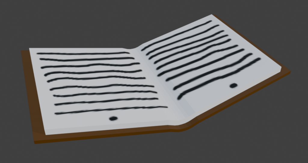
B is for Book
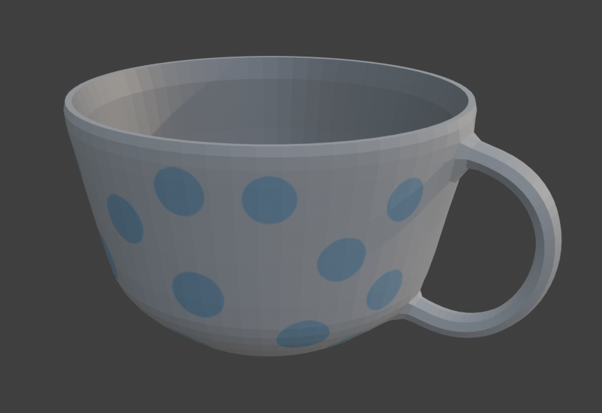
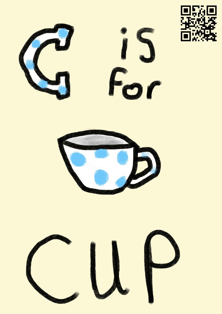
C is for Cup
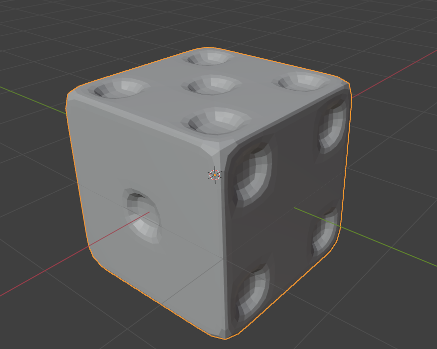
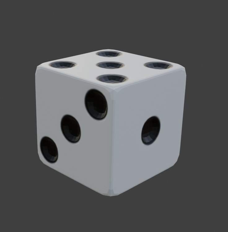
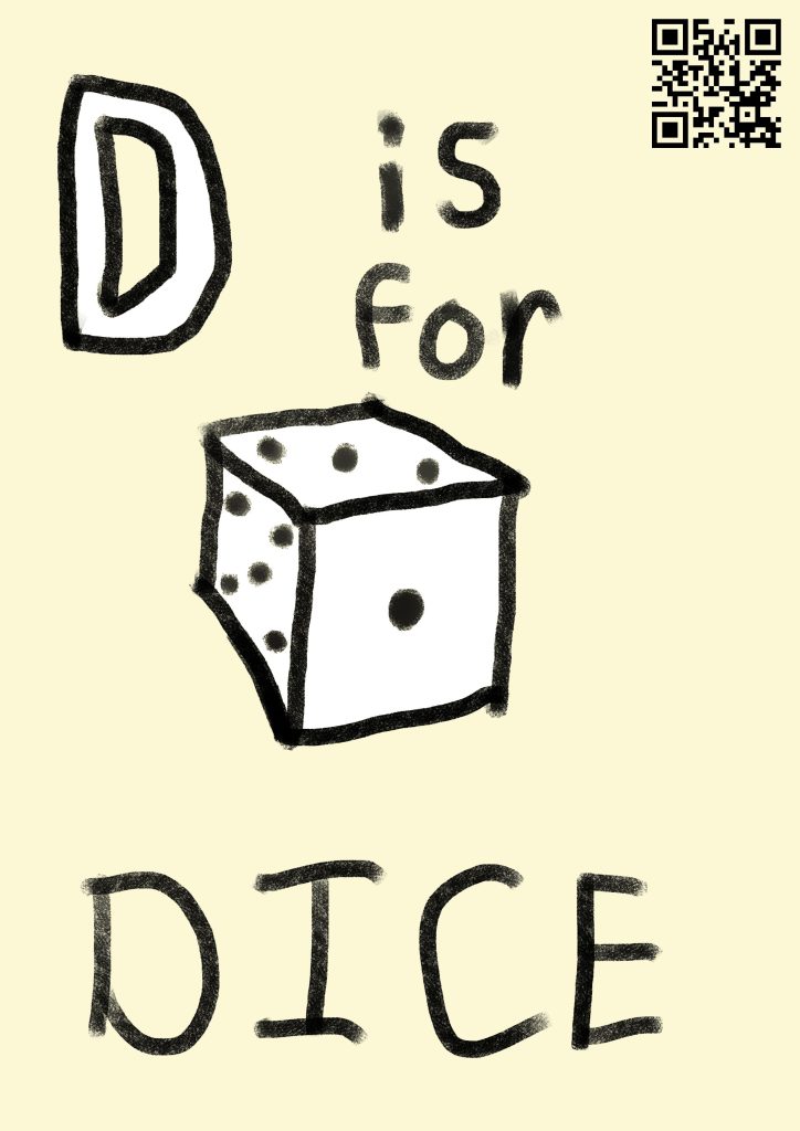
D is for Dice
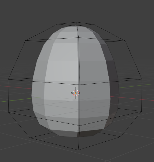
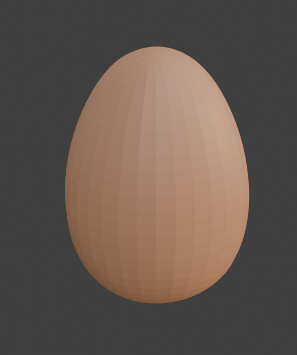
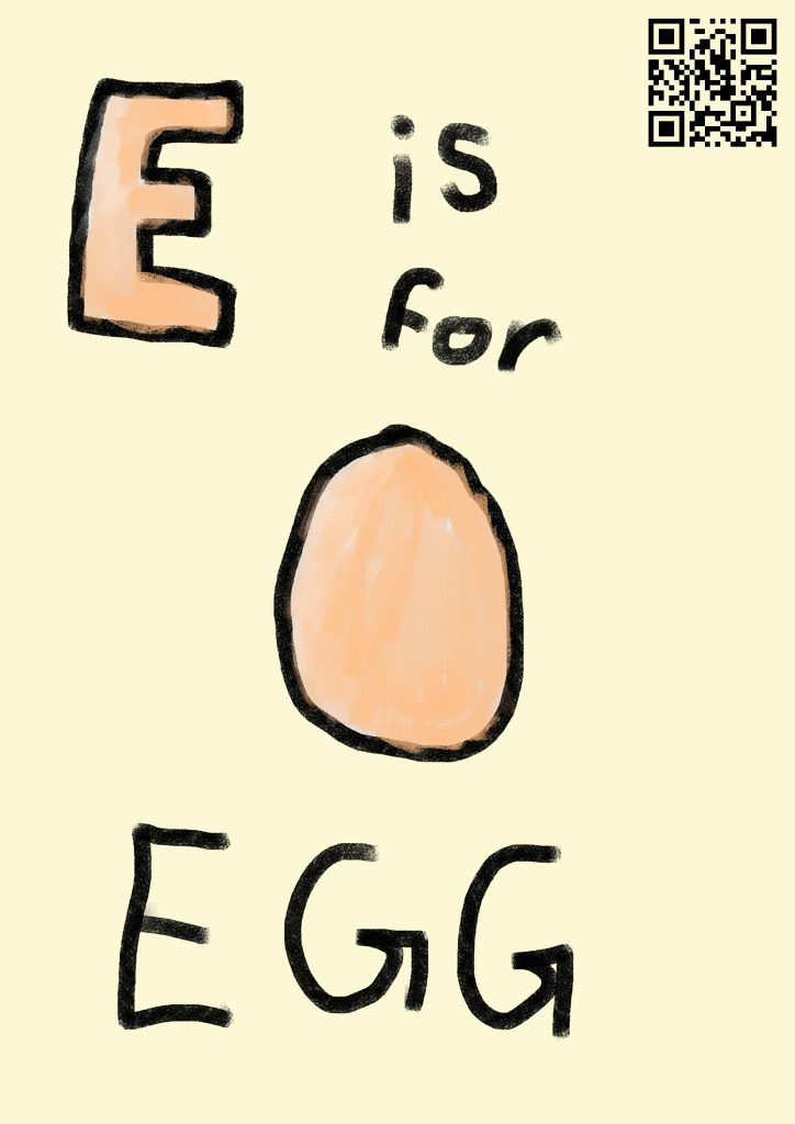
E is for Egg
These felt like a good balance between simplicity and interest – they have a mixture of colour, texture, and shape, so the different pages don’t feel too similar, while not being overly complex or confusing for the target audience.
Project Plan
To help with developing the project, I put together a basic project plan, to set out some milestones that I would need to meet. I also considered what I wanted to achieve with each step in terms of the user experience, to create an ideal product.
Planning + Concept Art: Designing how the pages will look, and getting a basic idea of what each model would look like. This could involve finding reference images, creating concept art of the pages, and possibly blocking out the basic shapes of the models. I will make sure that my concept art pays attention to the user’s experiences.
Create Pages: This stage involves creating all 5 of the pages, which will be used as the markers for the AR. These should be colourful and visually engaging, to appeal to the young audience of the project.
Create models: This will likely be the most time consuming section of the project, as the models themselves are the main focus of the project, so I want to take extra time to make sure they are as well crafted as possible.
Texturing models: UV unwrapping and texturing both fall under this category. I expect this to be slightly quicker than drawing the pages, as the textures should not be too complicated for any of the planned objects. As with the pages, I want to make these quite bright and colourful, to create visual interest for the audience.
Creating the AR experience: The final step is to import the models and markers into a Unity project, and upload the result to the ZapWorks website. The process for this is relatively simple, and I can follow the steps that we took during the module to learn about the site and how it works.
My goal is to complete each of these steps within a week, which will give me plenty of time to adapt to any issues or problems that arise during the project.
Basic Concept Art
Before beginning with the proper project, I decided to make some very basic plans and concept art to ensure that the idea would fit the ideas I had in mind, and get a simple idea of what I would need to create during each stage of the project.
For each object, I will need to create a page of the book, as well as a 3D model of the object. The page will have the text of the letter and object, as well as a picture of the object. When the picture is scanned by the AR camera, it will display the 3D model of the object. Ideally, I will be able to have one QR code at the start of the book, that will be able to display all of the different objects.
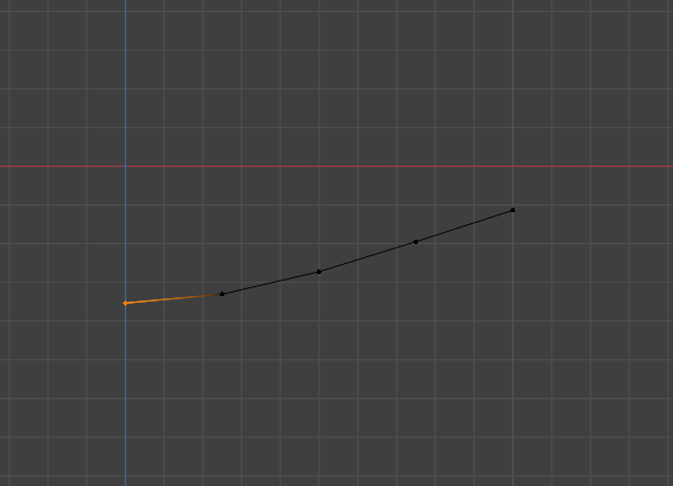
I decided to create a mockup of a page, to figure out the layout and design, as well as get a better idea of how the project would look. I wanted to make sure that the focus of each page was on the letter and the image, by making those the largest things on the page. I also wanted to leave some space for a QR code, as although I want to have a single QR code for the whole project, it may instead be necessary to have one on each page, so having space to put one may be very useful later on in development.
This design seemed like a good place to start. The large and exaggerated letter is the clear focus in the top left that draws attention immediately, followed by the picture in the middle. The text at the bottom is also large and easy to read.
For the first week, we began by looking at the uses of VR in terms of creating narrative and immersive experiences. VR is already much more immersive than many other forms of media, as the user is fully placed into the scenario in their own perspective, which grants a lot of opportunities for interesting uses and ideas – however, it also introduces a lot of challenges in creating VR experiences. For example, the ability to have full control of your camera and view at all times means that you have to take much more time and effort to ensure that any scene works well when viewed from whatever angle the user chooses – this involves a lot of work for lighting and set design, for instance.
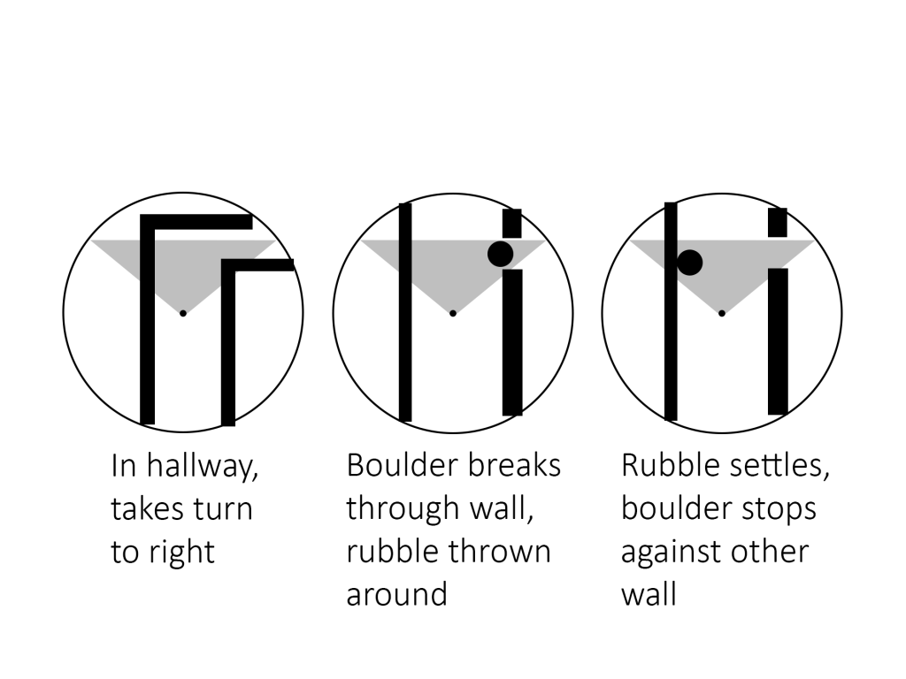
The first project was to create a moving 3D scene in Maya, using a VR camera so the viewer could look around wherever they want. The scene I wanted to create was an Indiana Jones inspired temple scene, where the camera would walk through a small hallway, before a boulder crashes through a wall ahead of them. For the wall breaking, I would use a Maya plug-in called MASH, which allows for procedural animations to be quickly generated to save a lot of time on animating.
I started by creating a basic storyboard to show the layout and idea for the scene.
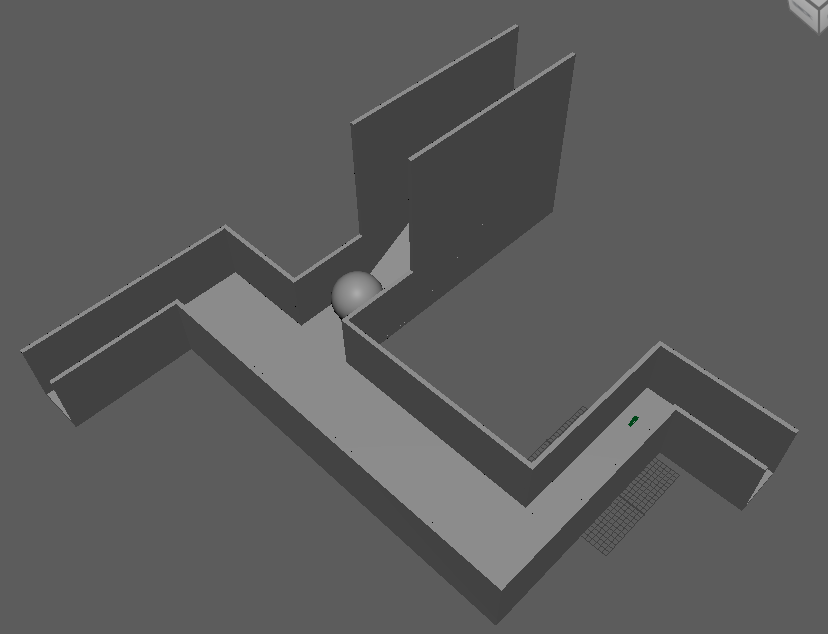
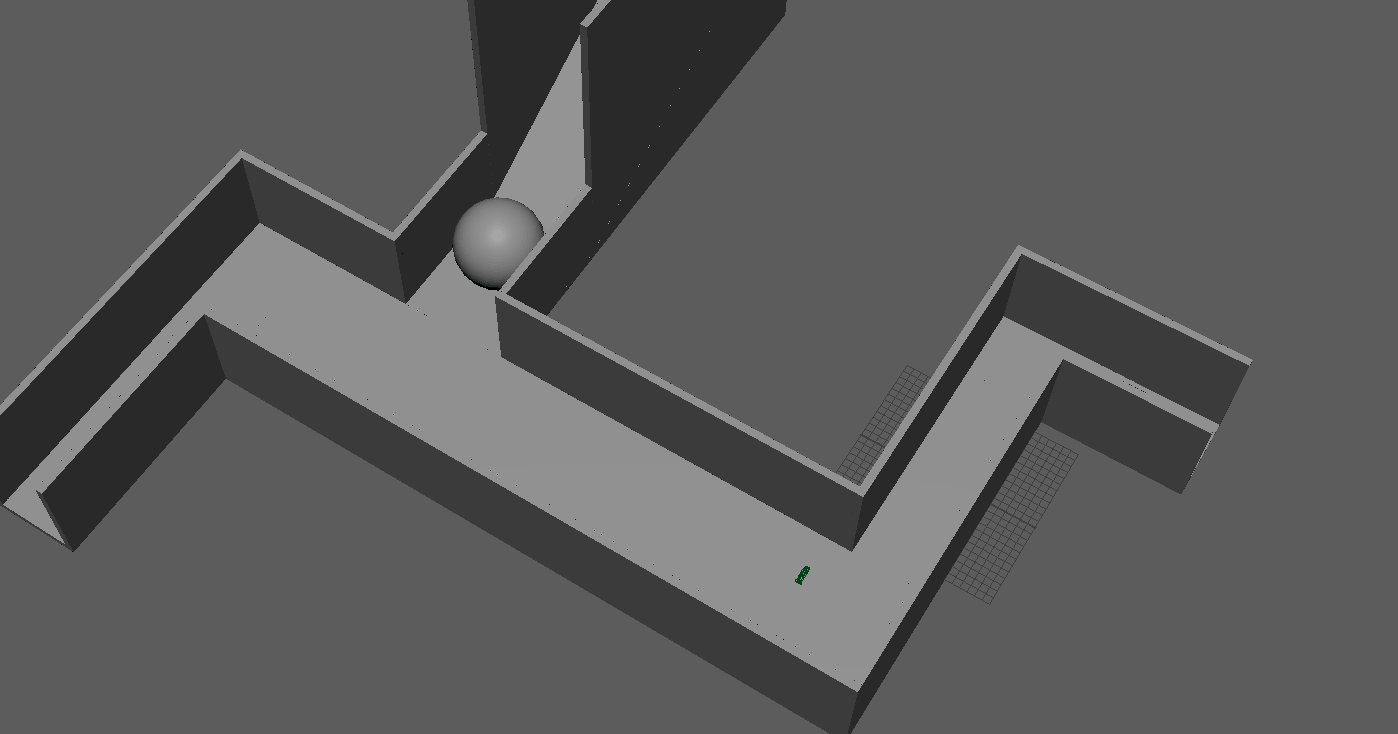
Next, I created the blockout shapes of the tunnel and ball. I added a roof, but disabled it while working so I could work on the animation inside before re-enabling it.
Next, I created the basic animation using keyframes – this was simply moving the camera down the hallway, and having the ball roll across the hallway when the camera got close.
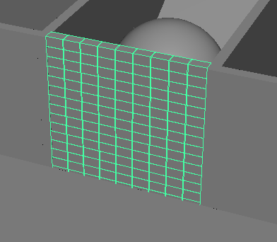
The last, and most important, part of the animation was the MASH wall. I started by creating a single brick-shaped block, which I then turned into a tiled MASH wall by duplicating it sideways and upwards.
I then animated it by having the entire wall rotate downwards at the same time the ball hit it, as well as moving the position and rotation of each block randomly to make them appear to scatter on the ground as the wall falls.
Finally, I added some lights to the scene and rendered the video.
The idea of a VR 3D video is very interesting, and could have various different possible options for a project to create. I will certainly consider it as an option for my research project.
Week 2 – FrameVR
The second week, we focused on different uses of VR technology. We specifically looked at FrameVR, a website designed to have meetings in virtual reality. It can also be used as a way to display different assets for a variety of uses.
I decided to create a simple display of my 3D character from a previous assignment to try out the website, and see if it had any potential for a kind of immersive portfolio.
While the potential was interesting for a virtual portfolio, I did not think there were many interesting ways to create a project with FrameVR, so I did not go any further with it.
As mentioned in my research project, I decided on creating the first 5 pages of an AR alphabet picture book, with an object for each letter. The objects I decided on creating were:
A is for Apple
B is for Book
C is for Cup
D is for Dice
E is for Egg
I had several other ideas over the course of planning – for example, trying to make all of the options food, such as B for Banana and C for Cherry – however, I couldn’t think of good options for further foods, and felt that it would be too restrictive for ideas. I also considered something like D for Dog, but felt that modelling an animal would be too complex and time consuming, especially if I did something on that level for every item. I decided that the items I have chosen were a good mixture of interesting visually, while being simple enough to be able to model them all within a reasonable time frame.
My goal is to have one QR code at the beginning of the book, which will activate the AR camera through ZapWorks. Then, that camera will be usable on any of the pages to see the AR model. However, I am not certain whether or not this will be viable. I have done some research into the ZapWorks Unity documentation, and cannot find any information about how to have multiple models linked to a single QR code. While I would like to have only one QR code, if I am unable to get the project working with only one, I will instead have a QR code on each page, which will open the ZapWorks project camera for that specific page’s object. This would be more inconvenient for the user than only having a single QR code, but I feel that it would still provide a good proof of concept for the idea.
Modelling
I decided to create the models in Blender, as I have some experience with the software, and had some ideas on how to use it to help make the models I had in mind.
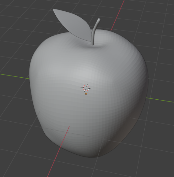
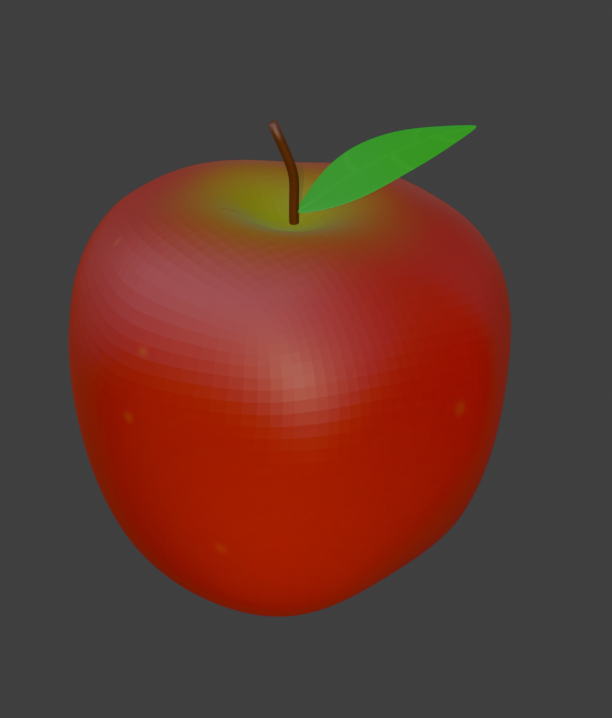
Apple
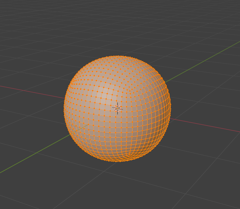
I started with the apple, as I wanted to create the models in the order they would be on the pages. To start, I used the default blender cube, and subdivided it into a more spherical shape.
While I could have simply added in a sphere object, which would have been slightly easier and better for sculpting, it would have been more complicated to UV unwrap, and require retopology. I decided that the model I was making was not going to be detailed enough for the difference to matter, and that I would rather have an easier process texturing than a slightly more detailed sculpt.
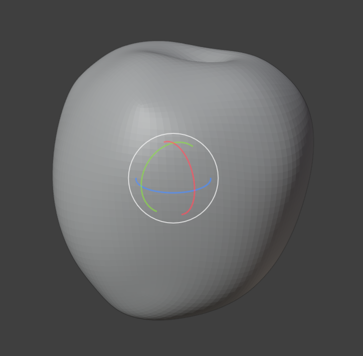
I then used the sculpt tool on the sphere to form the shape of the apple, using Blender’s reference system to shape it to the basic shape, then modifying it until it looked better for my more low resolution model.
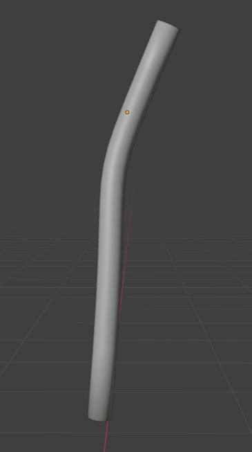
Next, I added the stem. I did this by creating a curve, adjusting it to the correct shape, and then adding a thickness modifier to make it a solid object. I deleted the ends of the newly made cylinder, and refilled them with a face fill so that they were more rounded and fit the topology of the model better.
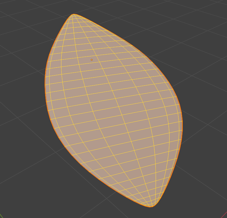
The last part to create was the leaf, which I made by creating a plane, adding some loop cuts to it, and adjusting the edges of the loop cuts to make the shape of the leaf. I then added a very slight thickness modifier, and subdivided it.
Finally, I positioned all three parts together to create the full model.
Book
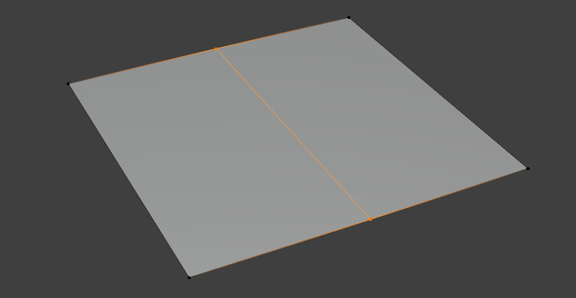
For the book, I began by creating a plane, and splitting it in half.
Next, I deleted the left half of the plane, before adding a mirror modifier to it. This meant that any changes I made to the right side would be copied to the left, which would ensure the book was symmetrical, and that I wouldn’t need to model both sides individually.
After creating a few more loop cuts, I used the Proportional Editing Falloff setting to make a curve in the plane, which would become the spine of the book.
With the spine curve created, I extruded from the edge of the plane in order to make the larger page and cover of the book, and once I had the shape correct, I added a thickness modifier in order to add depth to the book.
With the cover created, I adjusted the size of the spine and the height of the book until I was happy with it.
Finally, in order to add the pages, I duplicated this object, shrunk it so it would fit within the cover while making it slightly thicker, and moved it upwards.
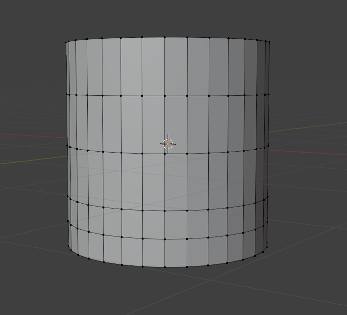
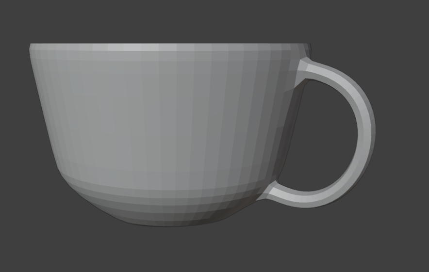
Cup
To create the cup, I started by creating a basic cylinder object, and using the loop cut tool to add a few extra edges around the sides.
Then, I resized the different edge loops, adjusting them to different heights to form the general shape of the cup.
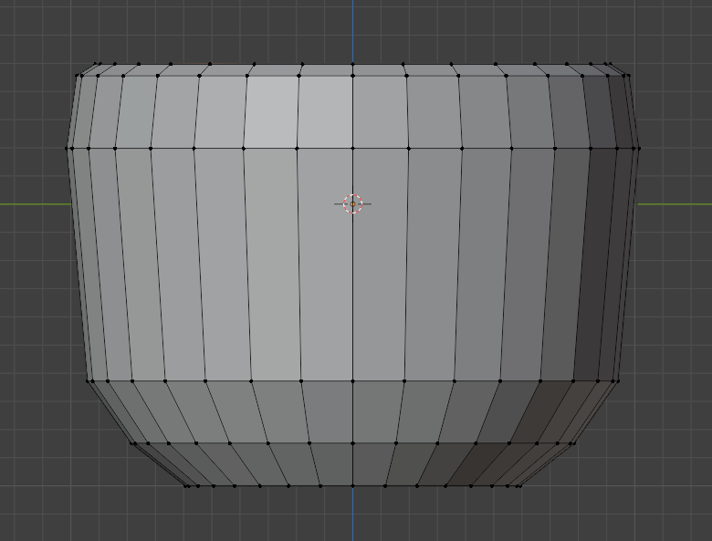
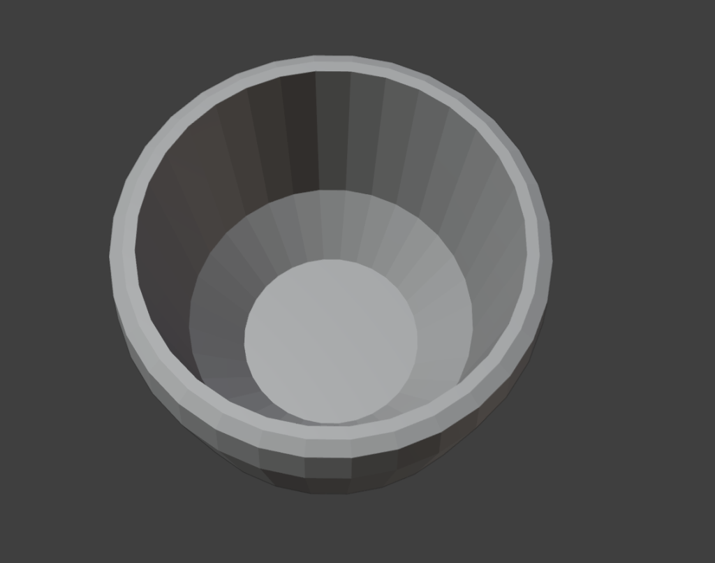
With the shape created, I inserted a face into the top of the cylinder, with a small space around the edge to make the sides of the cup have some thickness. I then extruded the new face downwards into the cup, to hollow it out and create the inside. I resized the face at the bottom and extruded again in order to add a varying level of depth and slope to the inside of the cup.
Then, I refined the shape of the cup by modifying the loop cuts, and adding a few more at the bottom to round it out more. When I was happy with the shape, I cut out a few faces at the top and bottom of one side, and created a bridge between the two for the handle. The last step was to subdivide the model to round it out even more and make it more smooth.
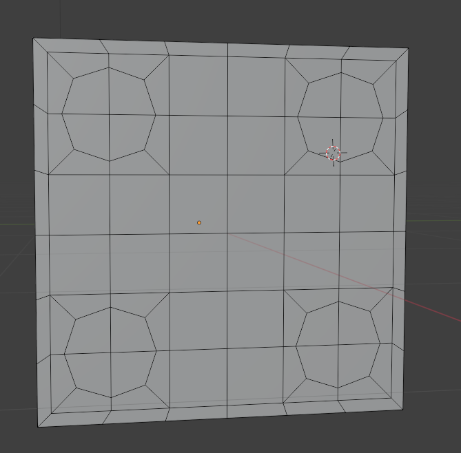
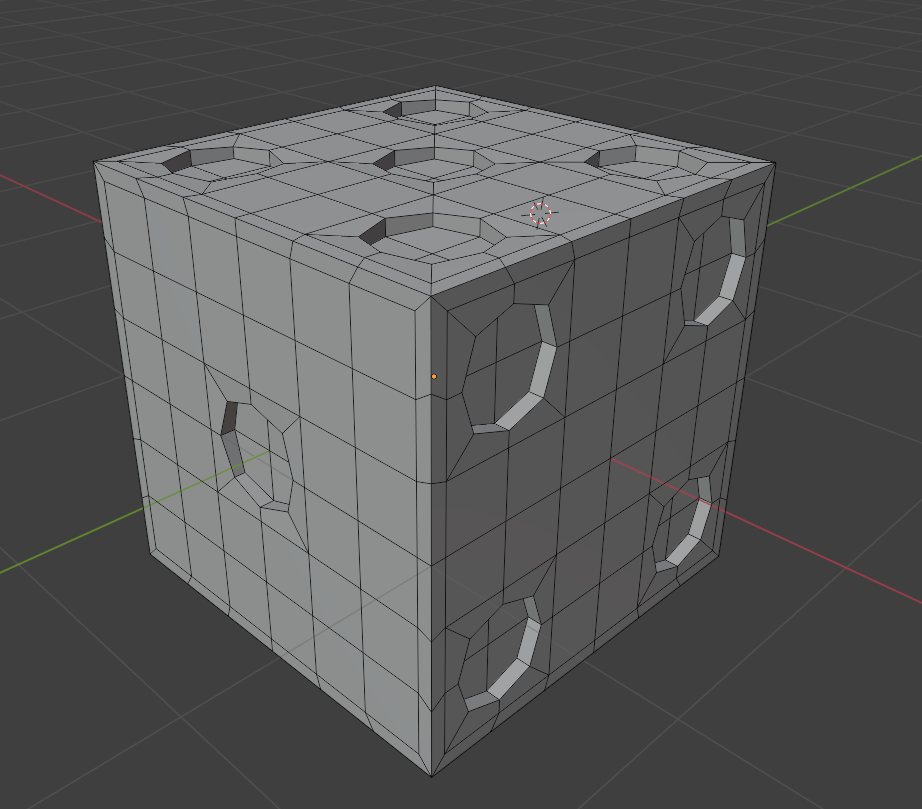
Dice
To start, I created a cube, and inserted a face into each side in order to create a small border around the outside of the cube. This meant that when I added the holes in the dice for the numbers, it wouldn’t mess with the shape of the edges when subdividing the model at the end.
Then, I added more loop cuts in order to divide each side into 9 squares – these would be used to add the dice dots for the numbers.
Each of these squares was then further divided into four sections, to create a circular shape for the dice dots.
To start creating the dice dots, I inset faces on each side to lay out where the dots would go – represented by the squares on the dice.
With the spots for the dots laid out, I next rounded them out by adjusting the corners of each of the dice spots to make an octagon shape. When I subdivide the model later, these will become much more rounded, and look much more like the circular dots I am trying to create.
To add depth, I then extruded each of the dots inwards slightly.
Finally, I subdivided the model to round it out.
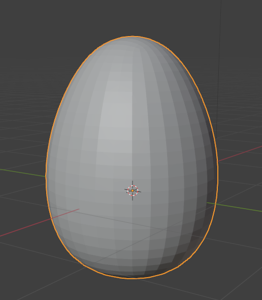
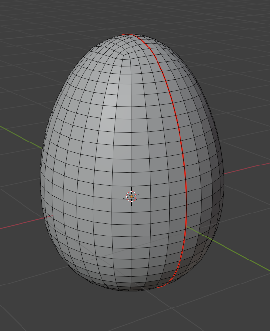
Egg
The egg was the simplest model to create. I started by making a cylinder, subdividing it, and adding a few loop cuts, adjusting them similarly to the cup model in order to make the shape of the egg.
After that, all I had to do was subdivide it further to smooth it out.
Texturing
To begin texturing my models, I first needed to UV unwrap them. This would allow me to paint the textures onto the models. To do this, I added a seam around each model, so that they could be properly unwrapped.
Then, with the models unwrapped, I could start on the texturing. This involved painting the textures onto the models, allowing me to colour them in the ways I wanted. I kept the colours simple, mostly just using single colours with slight detailing, such as small spots on the apple and egg, and writing on the book.
The textures are saved as images, which I can import into Unity to add the textures back to the models.
The texture image for the apple, which gets applied to the model.
ZapWorks Unity
Once all of the models were completed, I started to work on setting them up in the ZapWorks Unity project.
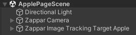
First, I did the basic setup for ZapWorks, which I could then use for all of the models. This involved creating a Zappar Camera, and a Zappar Image Tracking Target, which would link together.
With the basic template set up, all I had to do was use the built in Zappar image trainer to add a page as an image, and then link the model to the Image Tracking Target for that page.
Next, I spent some time trying to figure out how to have multiple different AR image trackers linked to the same QR code. I tried having multiple scenes in a project, but when uploading the project to ZapWorks, only the first scene was used, while the others simply did not have any effect from the AR camera. I also experimented with having multiple image tracking targets and cameras in the same scene, but not only did this lead to strange glitches with the AR models, where different pages and models could be seen, it also made the file size too large to upload to ZapWorks when more than a couple of models were added, as ZapWorks projects can only have a project below 25mb.
An example of what happens when trying to add multiple Zappar Cameras and Image Tracking Targets to a single scene.
After spending a while trying to find a solution, such as lowering the detail of the models and textures to reduce file size, I eventually decided to simply create a separate project and QR code for each model, as I could not find a solution to having all of them linked to the same QR code.
After making all 5 of the scenes in Unity, I uploaded each of them to the ZapWorks site as their own projects. This gave me a QR code for each, which when activated, would open an AR camera for the respective page. The last step for the project was to add these QR codes to their respective pages, to make the experience much easier and more convenient for the user. I also removed the white background from the QR codes so they would blend in better with the page, and not look too out of place.
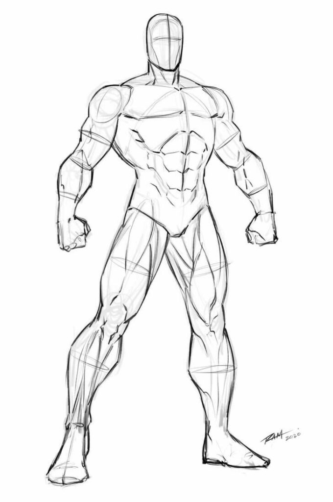
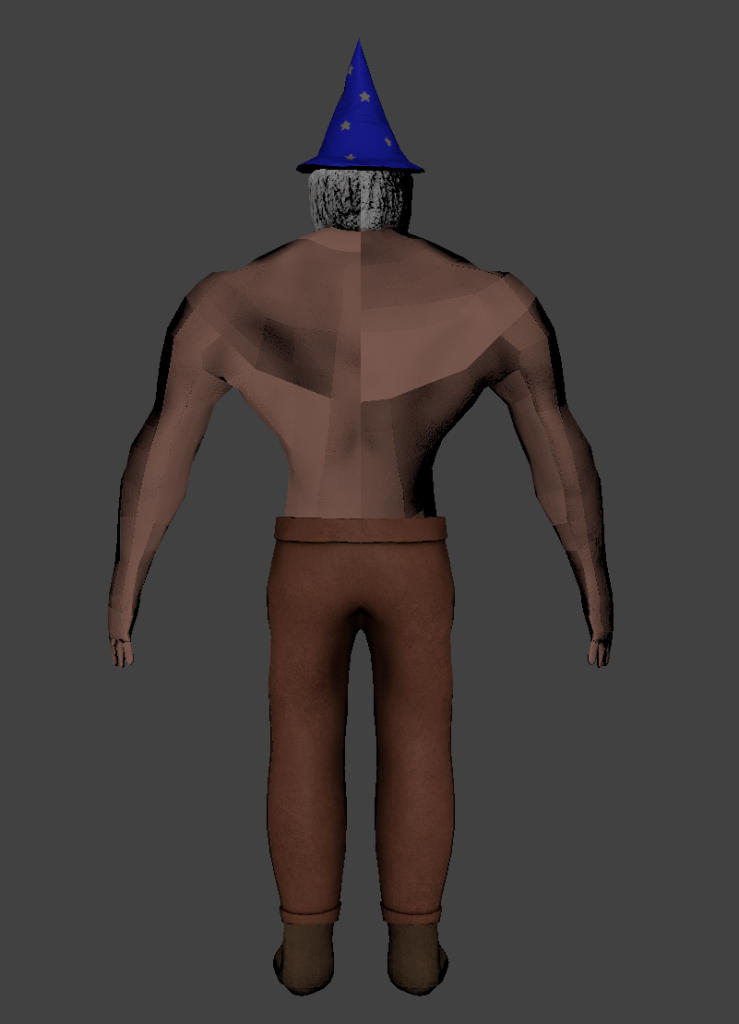
The first thing I did was to consider my character and their design. While I was not going to use the model I had created in the Character Design assignment due to various issues with it, I still wanted to base my animations off of that character, as I had various ideas and felt the concept was interesting enough to explore.
The character is a muscular wizard, which I felt was an interesting twist as wizards are often depicted as frail and physically weak. This concept also gave me various ideas for possible animations, as I could combine ideas for both the physical strength of the character, as well as the magical nature.
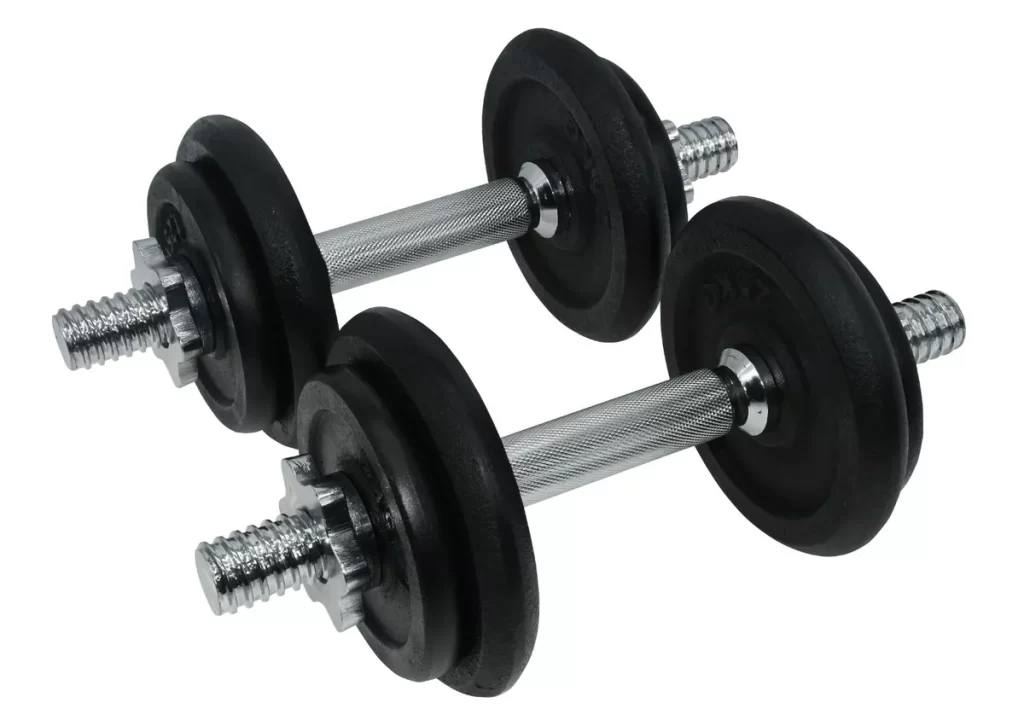
I spent some time coming up with basic concepts for what my three sequences could be. A walk cycle was one of the first ideas, as it is quite simple, but has room to show a lot of the character’s personality. I also wanted one sequence that would show off both of the main aspects of the character – I decided on having the character lifting a dumbell with one arm, while holding a book to read in the other. For my third sequence, I went back and forth on a few options – including lifting a barbell, using a magical staff to cast spells, or throwing fireballs – but the option I settled on was a sequence of the character flexing.
Next, I spent some time considering the style of animating I wanted. I decided that I would try to have a more cartoony, exaggerated kind of animation, to emphasise the more comedic aspects of the character. This also meant that I could focus a little less on realism with the movements, instead opting for more interesting and cartoony movements.
References for Sequences
Now that I had my three ideas, I looked online to find some references that I could use to help me animate my sequences.
Firstly, the walking animation reference I found is a clip from a cartoon version of the book “Treasure Island” of the character Dr Livesey walking.
Dr Livesey (Treasure Island, 1988) walking
I felt that this had the right level of cartoony exaggeration, and fit well with the design of the character.
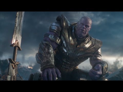
Next, for the scene of the character lifting while reading, I looked at a specific pose that Thanos had in Avengers: Endgame for the way the character would be sitting, and then found a video of someone curling a dumbell for referencing the animations for the arm.
A reference for the pose of the character sitting.
A reference for the animation of lifting the weight.
Finally, for the flexing, I used an emote from the game Overwatch of the character Reinhardt, as seen in the following video.
A reference for the animation of the character flexing.
Choosing a Model
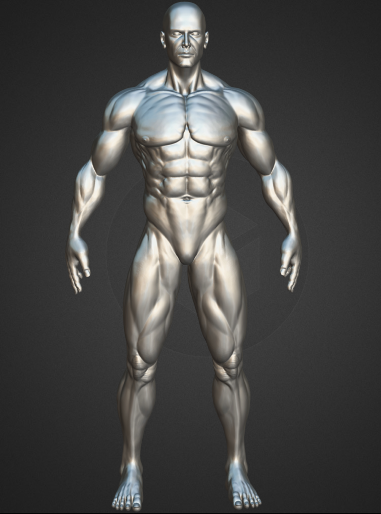
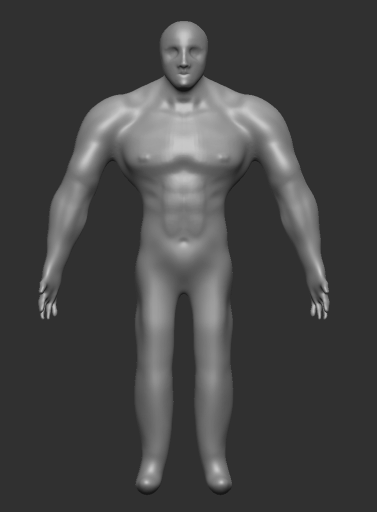
As mentioned previously, I decided to find a model to use from online, as the model I had created in the character design module had a few issues with the topography and overall design. After looking through a few options that had a similar build to the character I had created, I settled on the following model on Sketchfab.
I chose this model for three main reasons – first of all, the physique was very similar to what I had in mind with my original character design, so it would work well as a replacement. Secondly, the more cartoony style also fit with the theme of the animations I had planned. Finally, the model was quite simple, which meant I could focus more on the animations than worry about any smaller details of the model itself that might cause difficulties, such as clothing or accessories.
Rigging the Model
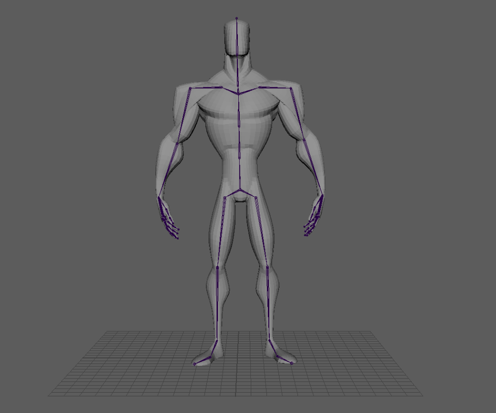
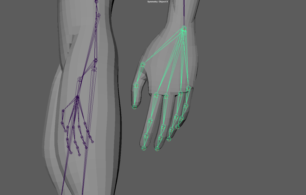
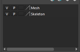
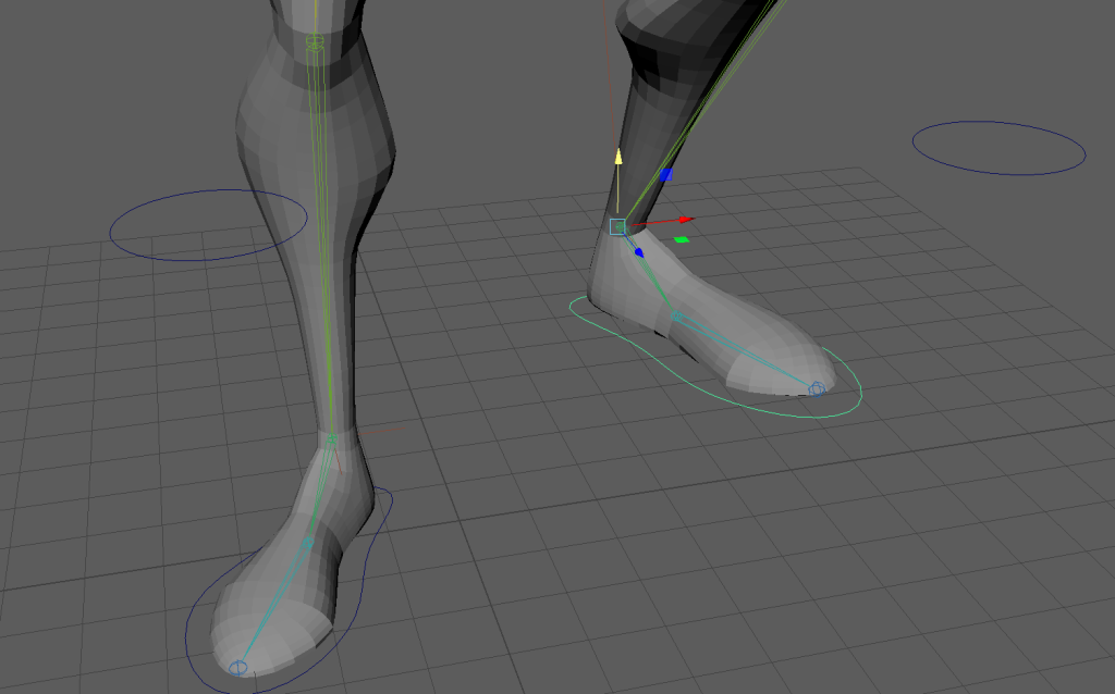
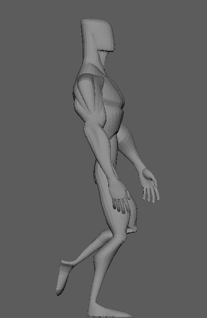
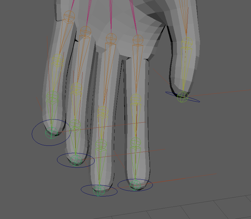
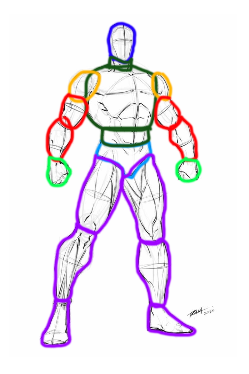
After loading it into Maya, the first step was to rig it with a skeleton. Using Maya’s rigging system, I added the joints that I would need. The most complex part was the joints for the fingers, which I needed control of for the weightlifting sequence in particular.
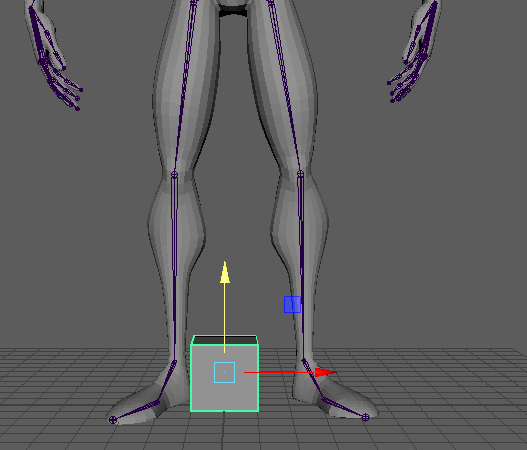
It was during this process that I realised that the model I had download was not fully centered in Maya – this lead to a couple of issues with mirroring the joints, and meant that the skeleton may not be perfectly centered. However, as I had already made a good amount of progress by the time I realised, I decided it was not worth restarting in order to fix it – especially since the movements I would be doing for the animation would be controlled by the various controls that I’d set up, which all work off of the relative position of the model, rather than based off of the origin point.
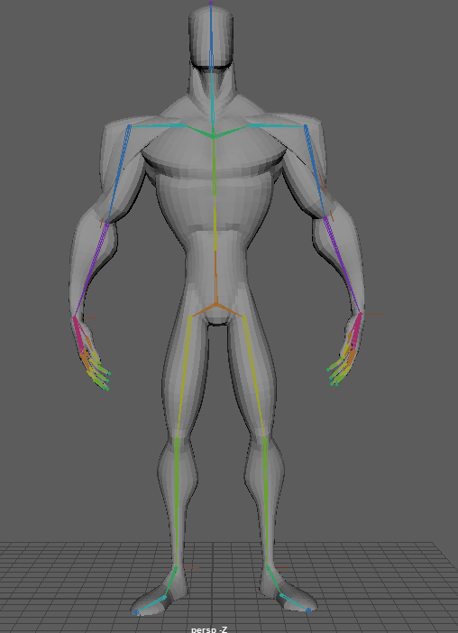
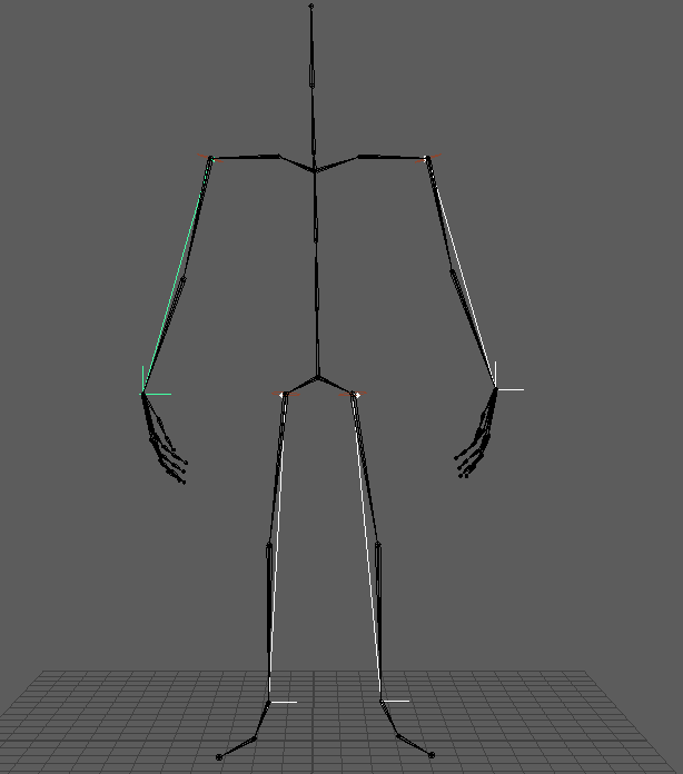
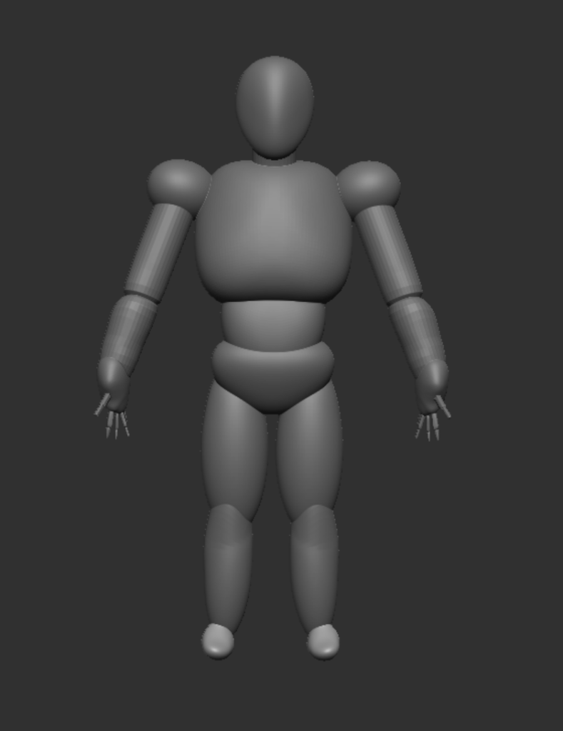
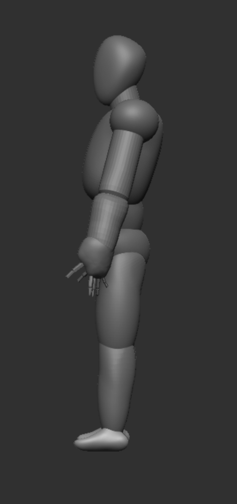
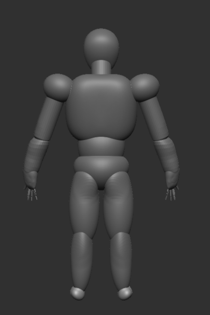
The overall skeleton of the model.A closeup of the skeleton for the hand, with each finger modeled.A cube placed at the origin, to show the offset the model has from the center.
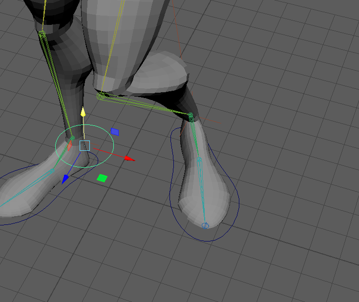
With the skeleton created, I next added some basic IK handles to be able to adjust the arms and legs of the model. IK handles work by linking the movement of several joints together, so that when the end point of a limb – in this case the wrists and ankles – is moved, the rest of the connected joints will also be moved, up to the other selected joint – the shoulders and tops of the legs. Setting these up also involved skinning the model, and binding it to the skeleton, so that the actual mesh of the character would move when the skeleton did. I also created a layer each for the skeleton and the mesh, so I could more easily modify and configure the seperate parts of the model.
The IK handles had a few issues with moving different, unconnected parts of the model. This is because I had not yet done the weight painting for the model – however, these IK handles are simply to help for when I do do the weight painting, and are not the final controls that I will have for the model. After weight painting, I will be switching these out for better versions, including handles that can be switched between IK – where the movement of the “child” node, such as the wrist, affects the nodes before it – and FK, where the movement of the “parent” node, like the shoulder, affects the nodes after.
The model with the skin bound to the skeleton.The layers for the mesh and skeleton.The skeleton with the IK handles added and highlighted.An example of the model distorting when using the IK handles due to not yet completing the weight painting.
The final step before weight painting was to add controllers and constraints in order to make moving the model around much easier. I began with creating controllers for the feet, which I linked to the joints with point constraints, and then pole vector constraints to the knees and elbows. The point constraints on the controllers made it much easier to use the IK handles I had set up, and the pole vectors allowed me to rotate the knees and elbows to point in a direction I wanted.
The controllers for the feet.The pole vector constraint for the knee, allowing it to point in different directions.The pole vector for the elbow.
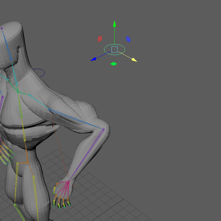
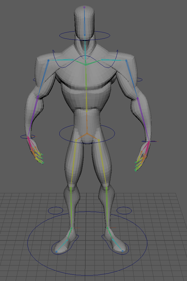
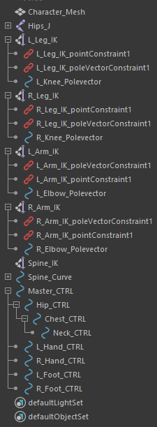
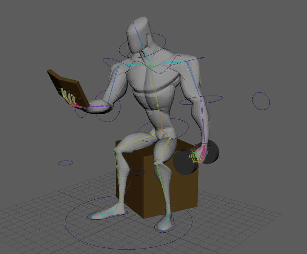
Next, I created an IK handle for the spine, with three controllers attached – the hips, the chest, and the neck – which I made children of each other so that when one part of the model was moved, the other controllers would also move with the model, instead of remaining in their original positions. I also added controllers for the hands, and then created a master controller, which I made all of the other controllers children of, so that I can move the entire model at once, with all of the parts connected.
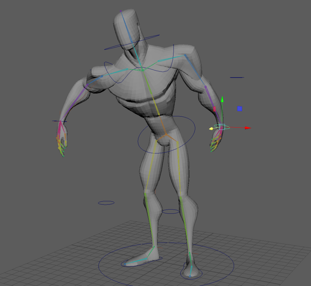
The model with all the controllers added.The outliner, showing the heirarchy of the different controllers.An example of the movement available with the controllers, showing how the other controllers stay connected to the model when moved by a different one.
Weight Painting
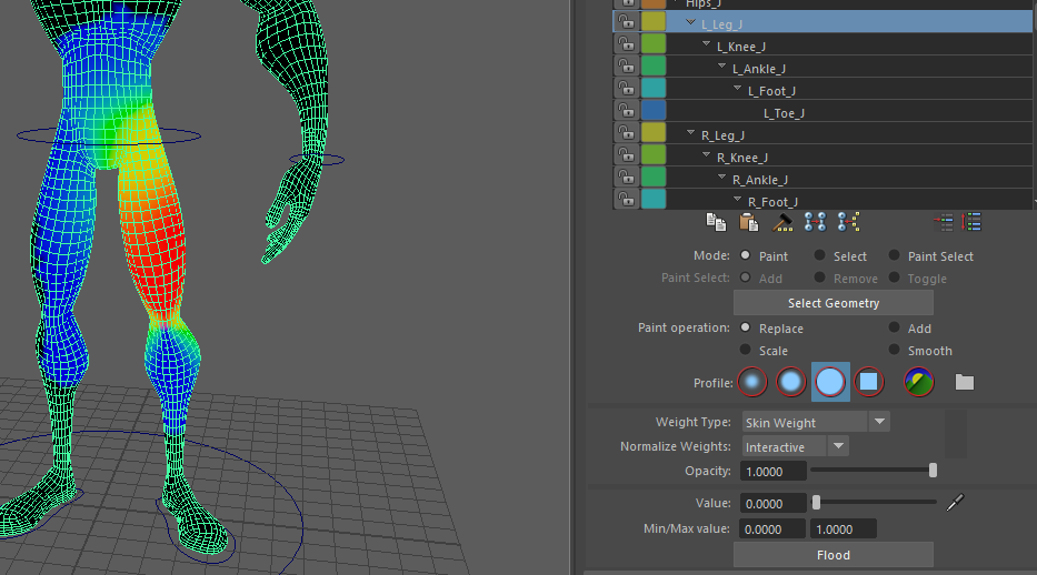
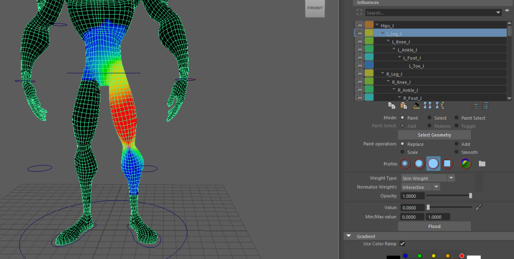
Now that I had some controls set up for my model, it was time for weight painting. This let me edit which parts of the model are affected by each individual joint. The main parts that I had to edit were the arms and legs. There were several parts of the arms that were affecting the side of the leg on the same side, and the legs would also affect the other leg slightly when moved. By removing the weight painting on those parts, it ensured that only the parts of the model that I wanted to be moved would be affected when moving different joints.
The weight painting for the top joint of the left leg before editing. The blue section shows that the right leg is also being influenced by that joint.The weight painting for the same joint after editing. The blue section has been removed from the right leg, meaning it will no longer be affected when the left leg is moved.
This process took a decent amount of time, as it was very important to ensure there were no errors with the weight painting. Even a small problem with an area being highlighted where it shouldn’t could cause large distortions in the animations, which would make the final product look much worse. There were some sections I was not certain about, such as how high up on the body the legs should be able to influence – however, I eventually reached a stage that I was happy with.
There were a few other small issues I had to fix during this stage of the process – the main one was that I had forgotten to add the orient constraing onto the controller for the wrists, meaning I couldn’t rotate them. This was quite easy to fix, but I spent some time checking the rest of the controls to make sure there wasn’t anything else that could become an issue later in the process.
IK/FK Switches
Once I was confident that the progress I had made so far was in a good state, I moved on to creating FK/IK switches for the arms. This gives a much greater level of control, and will make animating a lot easier.
The first attempt at this did not work out very well – when I unbound the skin, the model reset to its original position and meant the skeleton was now not aligned, which led to issues when I tried to reconnect this. I spent some time trying to fix this, but eventually decided it would be easier to simply redo this part and fix the issue with the skeleton before trying to make the switches.
I unbound the skin from the model, then readjusted the skeleton back to the model’s original positions. After testing it by rebinding the skin, and ensuring the controllers all still worked, I once again began work on making the FK/IK switches for the arms.
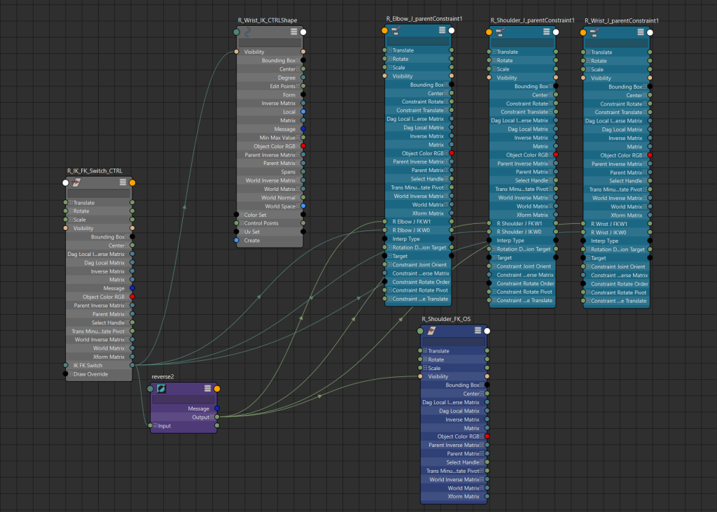
Using the node editor in Maya, I set up a seperate object with a variable that can switch between IK and FK. I linked this to the different controllers in order to allow me to swap between the two, so that when animating I could use whichever kind of controller would make it easier at the time. Although I could have simply had both IK and FK available at all times, this would have gotten very cluttered and confusing, which would make animating a lot more difficult. By making them swap between and hiding the controllers not currently in use, the model was much cleaner and easier to move and position as I wanted.
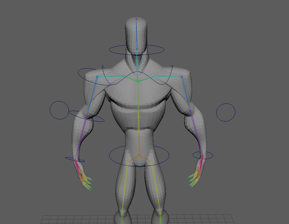
The controllers for the arms. The model’s right arm shows the FK controllers, which are moved by rotating, and its left arm shows the IK controller, which can be moved and rotated to position as desired.The node editor for the IK/FK switch. The value of the “IK FK Switch” attribute in the “R_IK_FK_Switch_CTRL” controller is used to determine whether the FK (if the value is 0) or IK (if the value is 1) controllers are visible at any time.
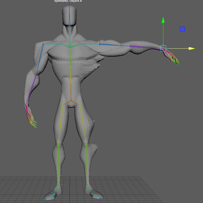
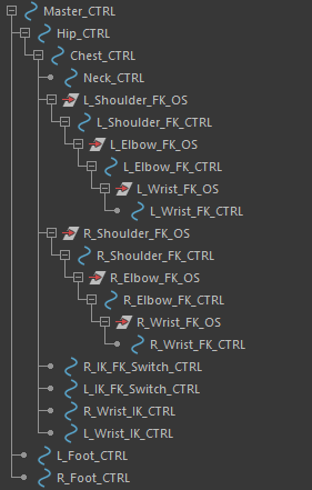
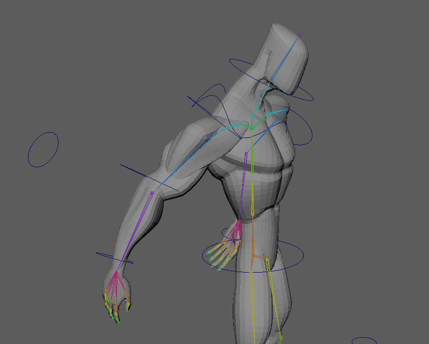
The last step of setting up the model was to move all of these new controllers into the right place in the outliner. It took a bit of trial and error to position them correctly – they had to be made the children of the correct controllers so that they would move as the other parts of the model did. Eventually, I found that it worked best when making these arm controllers children of the chest controller. The one downside with this was that tilting the chest forward also pushed the arms backwards – however, this was not a big issue as I did not plan to make much use of that particular motion.
The outliner for the different controllers for the model, showing the heirarchy.By simply tilting the chest controller forward, the arms are pushed backwards.
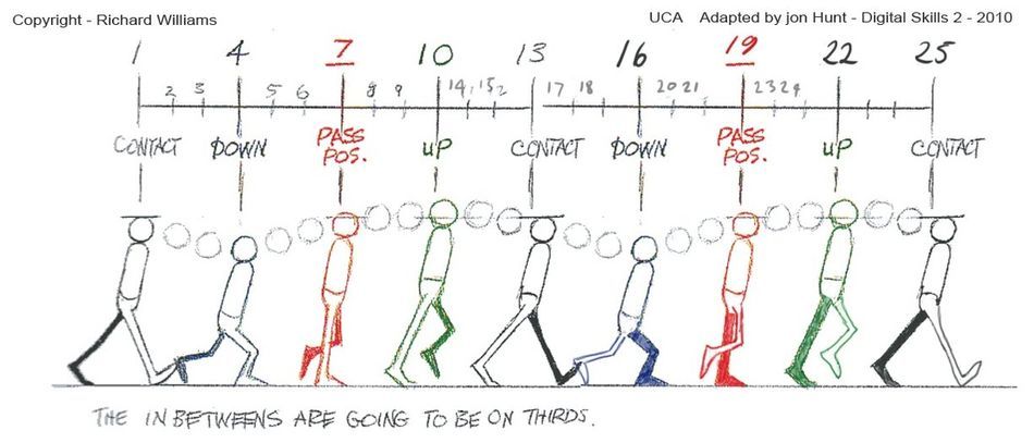
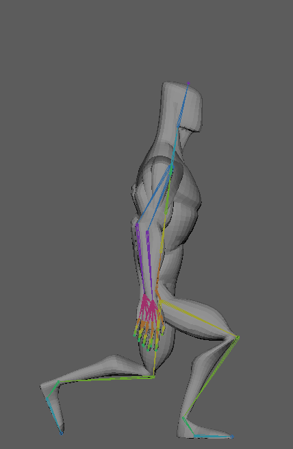
Animating the Walk Cycle
First, I spent a little time examining the reference GIF I had found, to figure out exactly how the character walked. It was a little difficult to figure out exactly how to translate the motions from 2D to 3D, but eventually I felt I had a good idea of exactly how the movements needed to look.
For the basic walk, I used this reference image from the Animator’s Survival Kit by Richard Williams. I used this to get the general movements of the legs and hips, which I then modified to try and fit more to the reference GIF – mainly by making the feet stay flatter to the ground for longer, and making the hip movements faster and stay at full height for longer. This looked a little odd, but my hope was that once the chest and arm movement was added, it would look more natural.
The reference image from the Animator’s Survival Kit which I used for the first version of the walk cycle.The first version of the walk cycle at half speed, using the previous reference image.
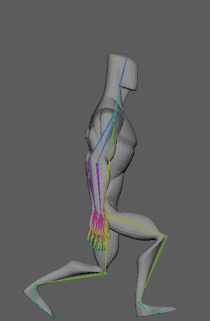
Next, I tweaked this basic cycle to resemble the reference GIF more. I flattened the feet to the ground more, to make the walk feel more grounded and sturdy. I also changed the arc of the vertical movement, making it faster and having the character spend more time at their full height.
The modified version of the walk cycle at half speed. The feet spend more time flat to the ground, and the up and down movements of the hips is faster, with more time of the character at full height.
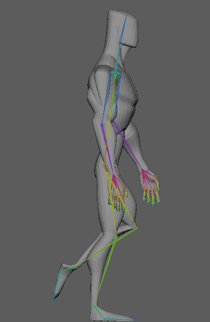
Now that I was happy with the movements of the legs and hips, I moved on to the chest and arms. I went with a lot of exaggerated movements, swinging from side to side with each stride, making the character look confident and strong.
The walk cycle with the chest and arm movement added.
After some final tweaks to make everything flow better, the walk cycle was complete. I feel like this is the weakest of my sequences, as a lot of it was a learning experience, but I think it is still a good animation that shows the personality I wanted it to.
The final walk cycle.
Animating the Weightlifting
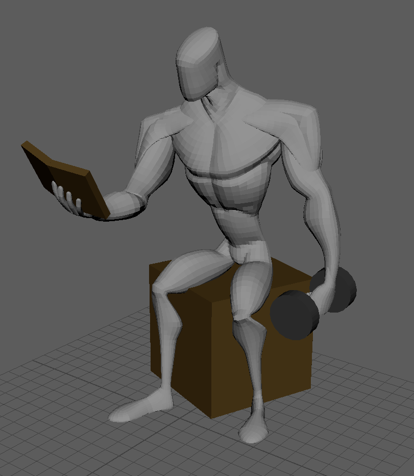
I began this animation by moving the character to a starting position, and creating some very simple shapes for a seat, a book, and a dumbell. While positioning the dumbell, I realised I had forgotten to add any controllers for the fingers – however, as I did not need any detailed movements for them, I simply added some basic IK handles and controllers to the hand I wanted to have holding the dumbell, and positioned the fingers around it. If I had more time, I would go back and add proper, more detailed controls to the hands, but as I had already completed one animation and was low on time, I decided this would be a good enough solution. I also made the dumbell a child of the hand, so that it would automatically follow it and I wouldn’t need to manually track it to the hand movements. I spent a good amount of time focusing on the arc of the dumbell, as it was the key part of this sequence, and having clean arcs is an important principle of animation.
A set of basic IK controllers for the fingers.The base position of the model, with the extra objects added in.The weightlifting animation.
I had initially wanted to have the character hold the dumbell in the air on its own for a moment using magic, turn a page in the book, then go back to lifting it – however, I had a lot of trouble with detaching the dumbell from the mesh during the animation and reattaching it, and eventually decided that it was not something I could achieve within the deadline.
Animating the Flexing
For the final animation, I animated a sequence of various flexing poses for the model, trying to focus on transitioning between them smoothly and cleanly with good timing. I also added a small amount of follow through to various motions, to make it feel more natural instead of the limbs simply stopping immediately after a motion.
Final Product and Thoughts
Overall, I feel that my animations captured the essence of the character well, and while I did run into various problems during the process, I am happy with my final product.
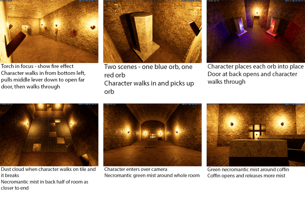
For my video, I planned to create the intro cutscene to a game set in the level I created for my Level Design module. The level is designed as traditional fantasy dungeon, where the player – instead of playing the hero venturing through – plays as the final boss, and has to progress backwards through the dungeon to reset the puzzles before returning to the final boss room to end the level. For the video, I wanted to create a cutscene of the original hero traversing through the dungeon the correct way, ending at the final boss room – where the real level would begin.
With the concept in mind, I started by writing out a list of all the different VFX I wanted to include in the cutscene, and a brief description of each one, along with where/how they would be incorporated into the cutscene.
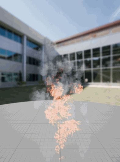
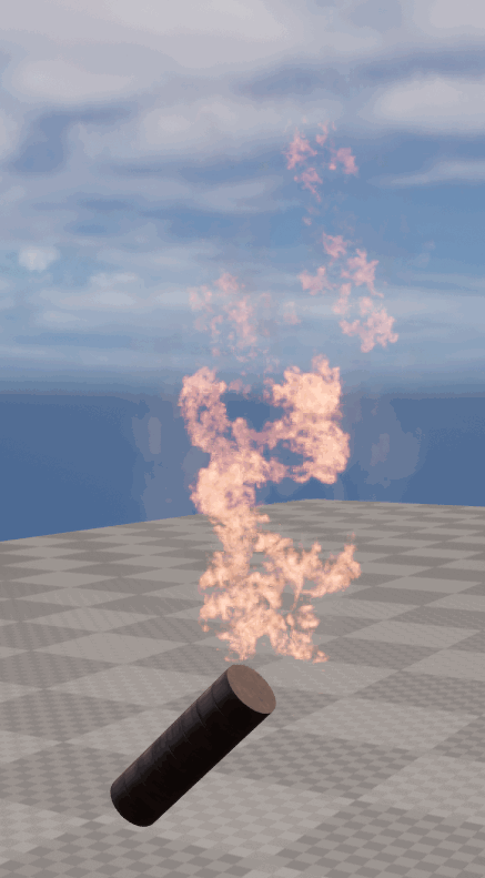
The various torches in the dungeon needed a fire effect, along with some smoke. These would be placed throughout the entire dungeon, in the background of almost every scene, so they were important to get right.
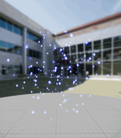
A sparkling effect to each of the two orbs used in a puzzle – one red, and one blue – to make them look more magical.
A dust cloud effect for when a floor tile falls as it is walked on.
Some necromantic magic effects for the coffin at the end of the level – this will be something like green fire or mist.
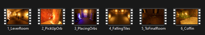
With the ideas of the different VFX I would use in mind, I went into the Unreal Engine project of my level, and took some screenshots to create a simple storyboard for the video.
Creating VFX
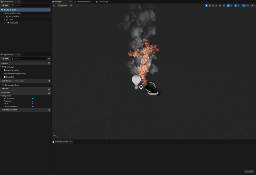
Now that I had a plan, I began to create the VFX for the video. I started by following the tutorials on canvas to create the fire and smoke effects for the torches throughout the map.
Then, I added the Niagara particle system into the blueprint I had already made for the torches throughout the level, so that the particle effects would be present on all of them.
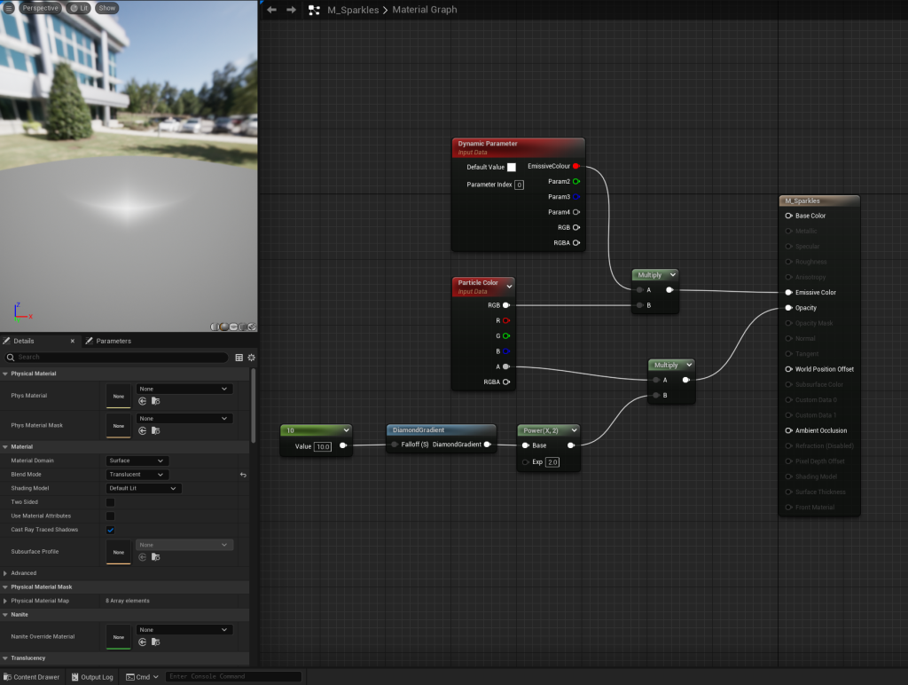
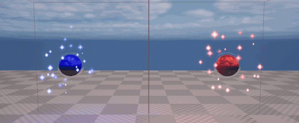
Next, I began to work on the sparkling effect for the two orbs. These are in the second puzzle of the game, where the hero has to find two of them in a maze and bring them back to the end room of the maze, in order to open the door to progress further. There is a red orb and a blue orb, so I would make the particle system for one, then copy it and change the colour for the other orb.
First, I created a material for the particles, in order to create the star/diamond shaped particles I wanted. This was mainly done with the DiamondGradient node, which would shape the particles when the material was added to the Niagara system.
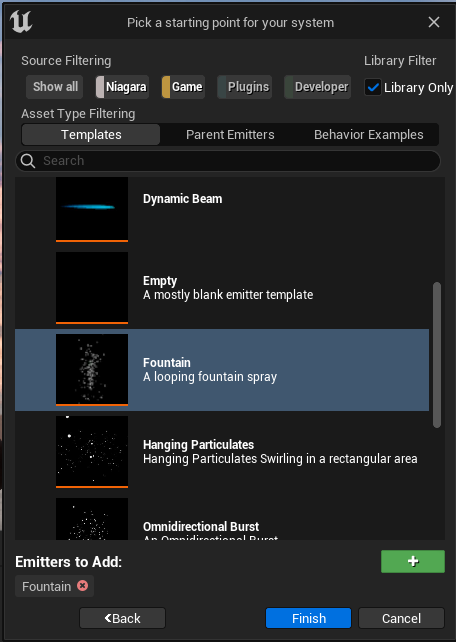
Then, I created the Niagara system for the sparkle effect, beginning with a fountain emitter.
The first step of creating the particle effect was applying the material I had just made to the sprite renderer. I then increased the spawn rate, to increase the number of sparkles that would appear. In the Particle Update section, I added a Dynamic Material Parameter in order to edit the Emissive Colour parameter I had added to the material, setting it to 100, and then increased the sprite size to make the sparkles bigger. I increased the radius of the sphere the particles could spawn in to 400, to spread them out more so they would appear around the orb instead of just from one spot inside it.
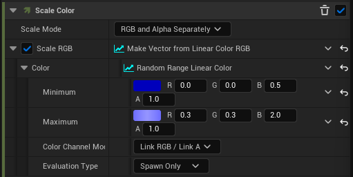
Next, I removed the Gravity Force so the particles wouldn’t fall, and reduced the velocity down to 50-100 so they wouldn’t fly upwards as fast as they initially did. This made them seem to hover and linger in the air more, rather than launching upwards. I also made the particles no longer rotate as they spawned, so they would spawn as the regular diamond without turning. Then, for the colour, I added a random range from light to dark blue that the particles would spawn as.
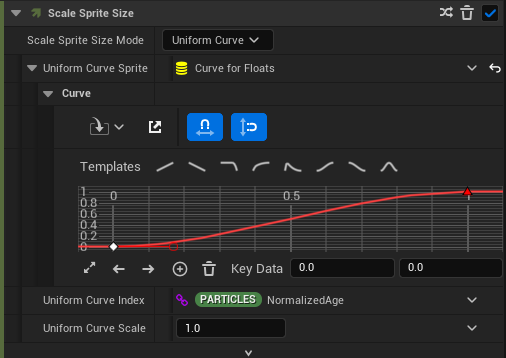
Finally, I added Scale Sprite Size to the Particle Update section, modifying the graph to make the effect look more sparkly.
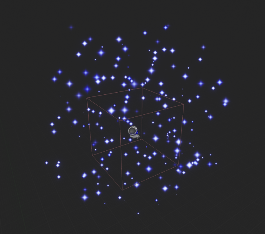
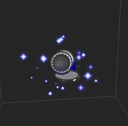
After adding the effect into the blueprint for the blue orb, it was clear that the effect covered much too large of an area, so I went back into the Niagara system and reduced the area the particles could spawn in, the size of the particles slightly, and the spawn rate, so that there would be fewer, smaller particles in a tighter area around the orb.
The original sparkle effect, which was covering much too large of an area.The modified sparkle effect, which takes up a much smaller area.
The blueprint for the orb already had a coloured light attached, which added to the effect. With one orb created, I simply copied the Niagara system and changed the colour of the particles from blue to red to create the sparkles for the red orb.
Next, using an Upward Mesh Burst emitter, I created an effect for a cloud of dust bursting upwards. This was for the breaking tile puzzle in my level – when the character steps onto an incorrect tile, it breaks, dropping them down below. The cutscene will have this happen once, where the character will fall, playing this dust cloud effect to show the tile breaking. After replacing the mesh renderer with a sprite renderer, I reused the smoke subUV spritesheet that I had previously used to create the smoke for the torches, changing the colour to a lighter brown/gray colour to match more closely with the tiles, so it appeared that the dust cloud actually came from the tile breaking. I also increased the angle of the cone of the burst, so that the particles spread out slightly more.
The last type of VFX I wanted to create was some green necromantic mist and magical effects, which would appear towards the end of the level to emphasise that the dungeon had some magical effects to it, as well as imply that the boss will be some form of undead.
I started with the two fog effects I wanted to make – both mostly the same, but with one having a higher spawn rate for the particle sprites, to create the effect of a more powerful, thicker fog. I created a Niagara system using the Hanging Particulates emitter, to make the sprites float and linger in the air. I once again used the Smoke SubUV spritesheet, changing the colour to green. I played around with the alpha value, but settled on leaving it as 1, as the sprite itself has some transparency to it already.
Next, I duplicated this system and increased the spawn rate from 20 to 80, to create a much thicker and more obvious fog effect. This would be placed around the coffin in the final room of the dungeon to make it seem more powerful and magical.
The last Niagara system I made was the burst of mist that would appear from the coffin at the end of the cutscene. I did this using a Directional Burst emitter, removing the Gravity Force, and rotating the burst to fire the sprites upwards. Then, I once again used the Smoke SubUV spritesheet with green colouring to make the same mist effect as before, and tweaked the sizes, lifetime, and velocity of the particles to get the burst effect I was looking for.
Cameras and Animation
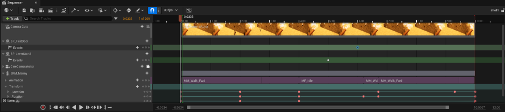
Now that I had all of my VFX created, it was time to work on making the cutscene itself. I started with the shot in the first room of the dungeon. This involves the character walking to a lever and pulling it, opening a door that they will walk through. The room has several torches, which I positioned the camera to be able to show. I used the built-in Unreal Engine 5 “Manny” skeletal mesh and animations to make the very basic animations for the character.
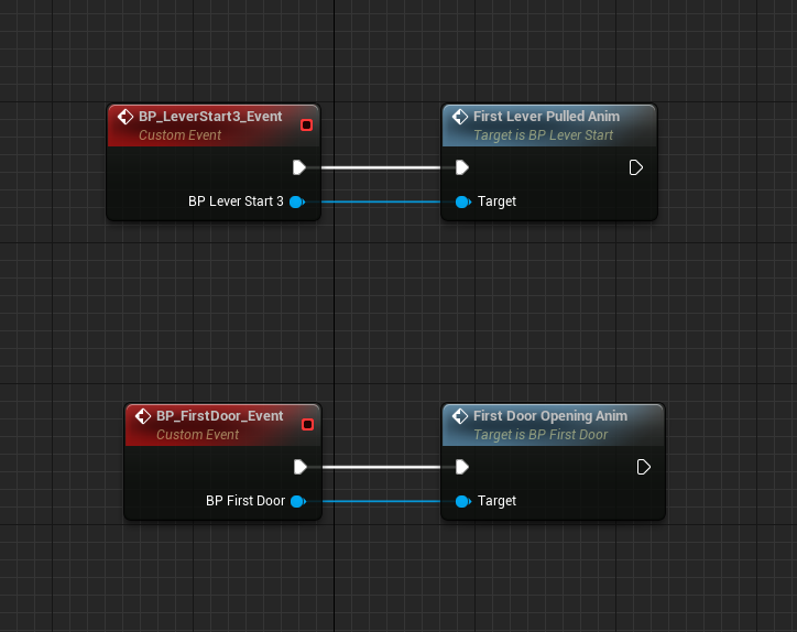
I also modified the blueprints for various parts of the level, such as the doors and levers, so that they could be fully triggered by custom events. Thanks to this, I could add a keyframe into the Unreal Engine sequence which would trigger the event at the right time in the animation.
Now that I had figured out how to make the shots and animations, I went through each of the 6 storyboard shots, using the same process of animating the character and parts of the level, placing the VFX I created where they needed to be.
While doing this, I realised that the mist particles I had made were very hard to see. I increased the alpha value from 1 to 2 to make it less transparent, so it would be more obvious and easy to see.
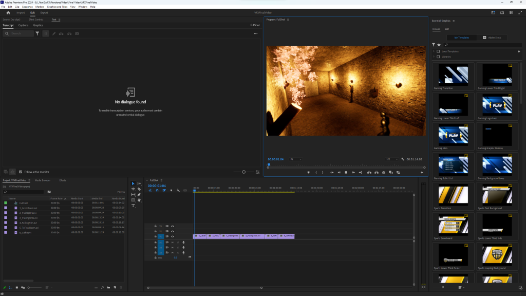
After creating all 6 of the shots for the final video, I rendered each one out individually as a separate file. Then, in Premiere Pro, I combined them all together into my final video.
Review
Looking back at my finished video, I think that the fire/smoke from the torches, the sparkles on the orbs, and the dust clouds from the breaking tiles all fit the standard and idea I was picturing in planning – however, the different green mist effects ended up being quite messy and not fully how I pictured them. Going back, I would try to spend more time editing them, perhaps trying different kinds of emitters or finding a more fitting sprite sheet for the effect I was going for.
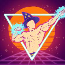
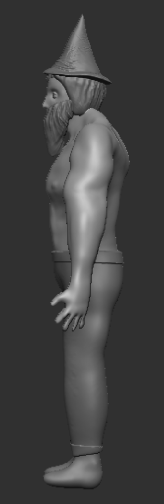
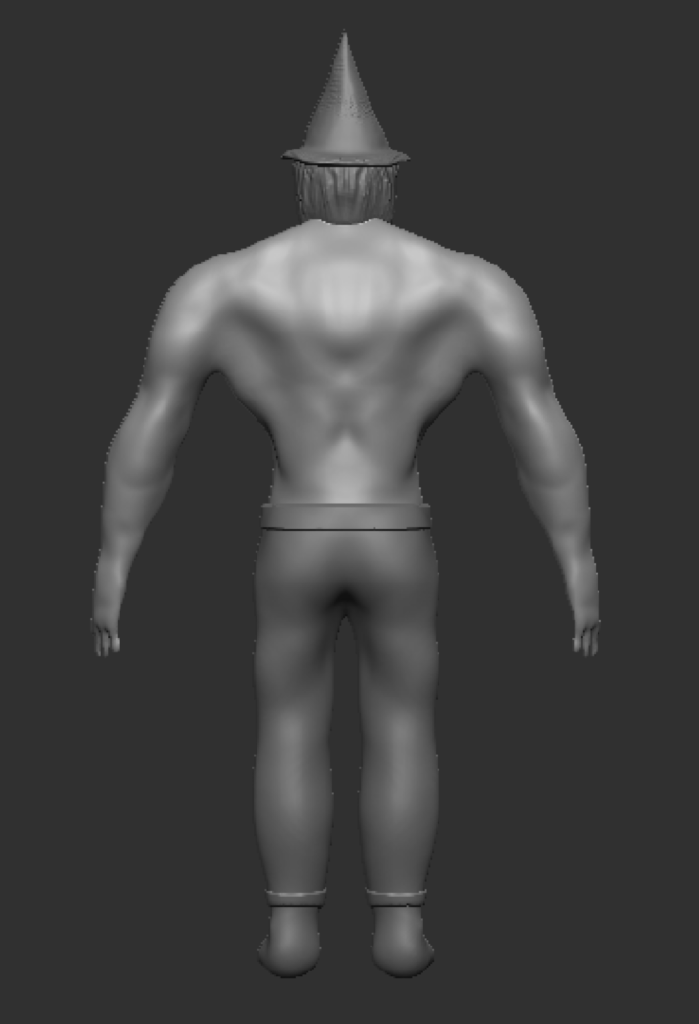
For my character, I decided I wanted to create a wizard, as I felt that it would be an interesting concept with a lot of traditional, stereotypical themes I could choose from, while having a lot of room for unique design decisions and ideas. To start, I looked for various different styles of wizard characters from different sources, to get a wide range of inspiration.
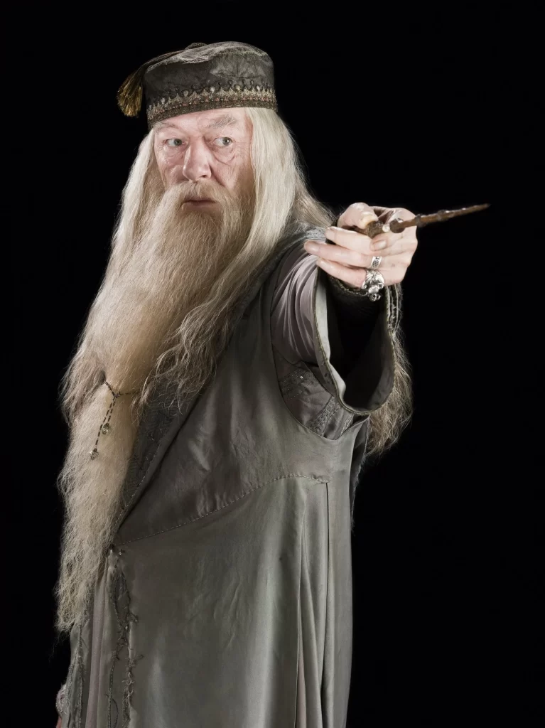
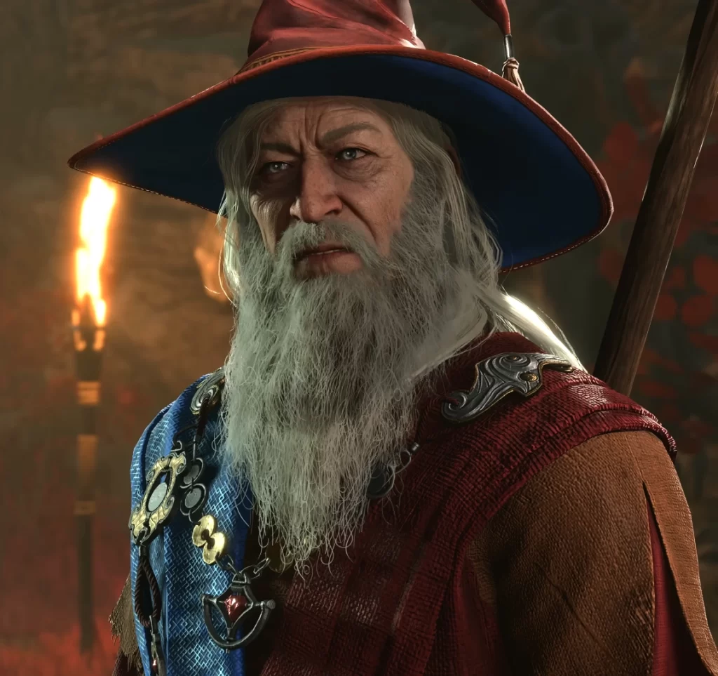
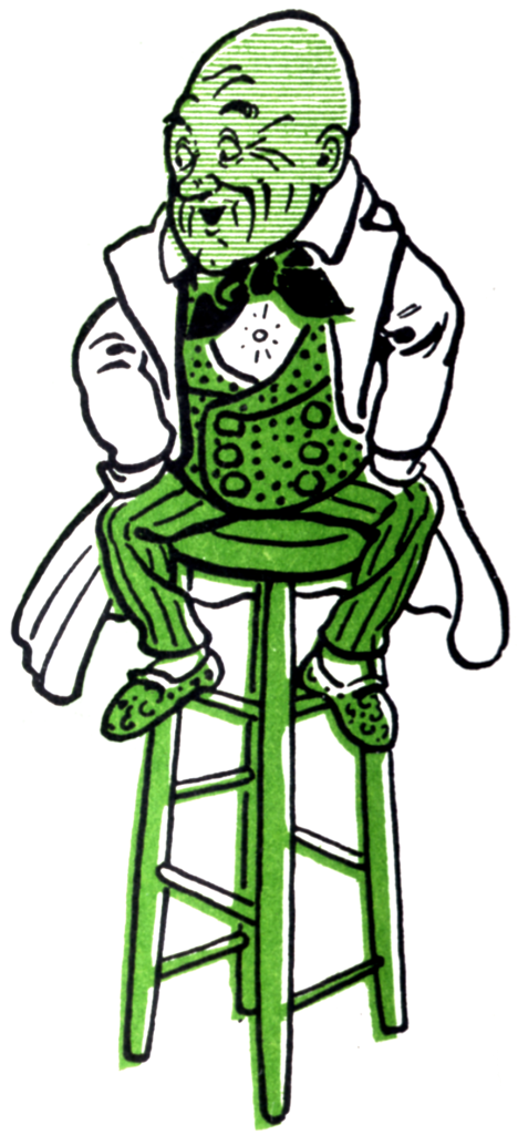
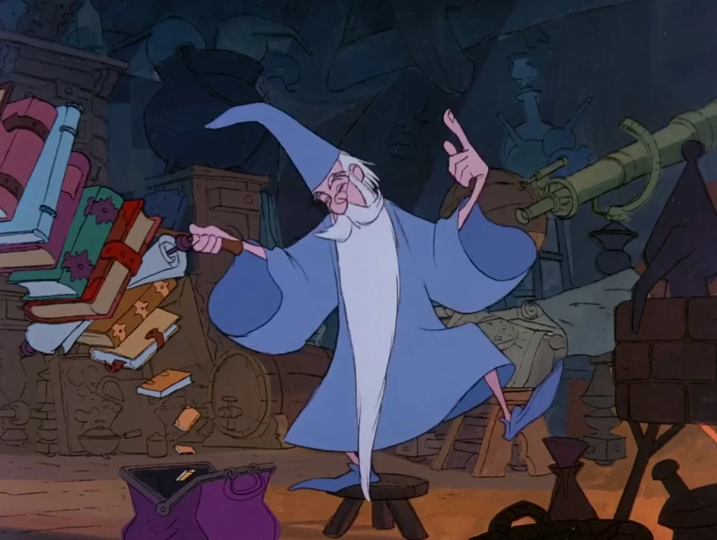
Doctor Strange – MarvelDumbledore – Harry PotterElminster Aumar – D&D Forgotten RealmsGandalf – Lord of the RingsOz – The Wizard of OzMerlin – The Sword in the Stone
From these, I decided that Merlin’s and Elminster’s designs were the ones I wanted to take most inspiration from – however, I also wanted to make my character unique. I decided that, instead of the common “old man” design wizards often have, I wanted to create a strong, muscular wizard, who used physical strength in combination with magic – as opposed to the older, more frail wizard designs that use magic. I went and found some references based on that.
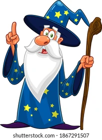
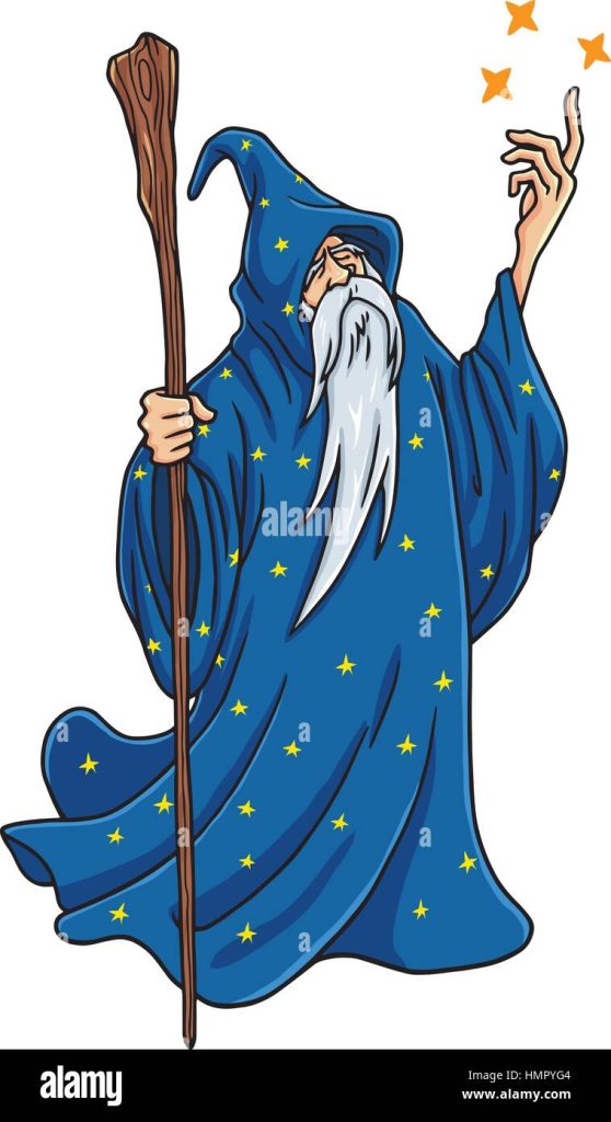
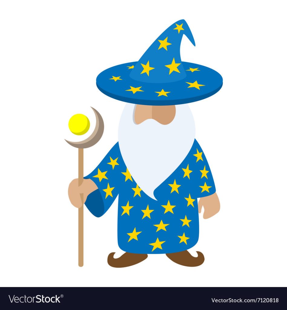
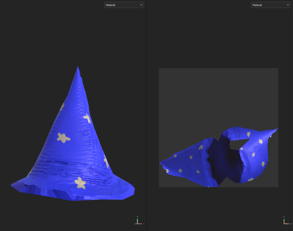
Since I was changing one of the major basic designs of wizards, I wanted to make sure it was obvious that the character was a wizard. To do this, I decided that using the blue colour theme of cartoony wizards would make sure that my character was easily recognizable as a wizard despite their unconventional build.
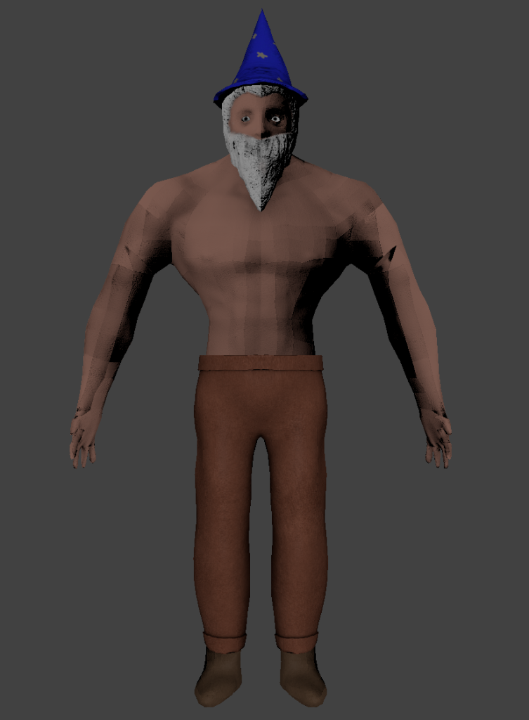
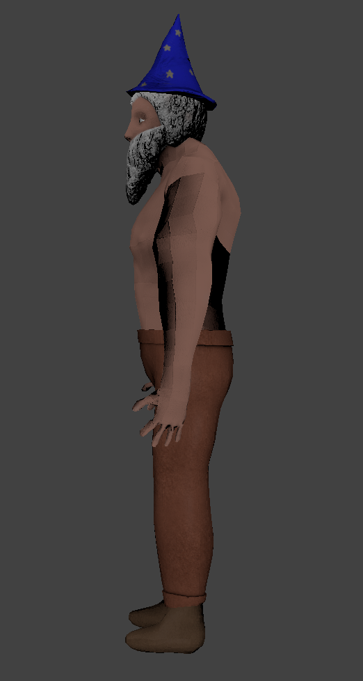
Combining the various ideas I had come up with inspired by these images, my plan was to create a muscular wizard with a blue pointy hat with yellow stars, shirtless to show off the muscles, white hair and a beard, and either a blue robe, or regular trousers for the bottom half.
Next, I thought about different accessories I could add on to the model to make it more interesting. These are things that would improve my character design, but are not absolutely necessary, meaning if I do not have time, I can cut them from the model. First, instead of a wand or a staff that wizards often have, I decided a magical dumbell would be interesting, fitting with the muscular theme.
I would replace the weight numbers on the dumbells with magical runes to make them more wizardly.
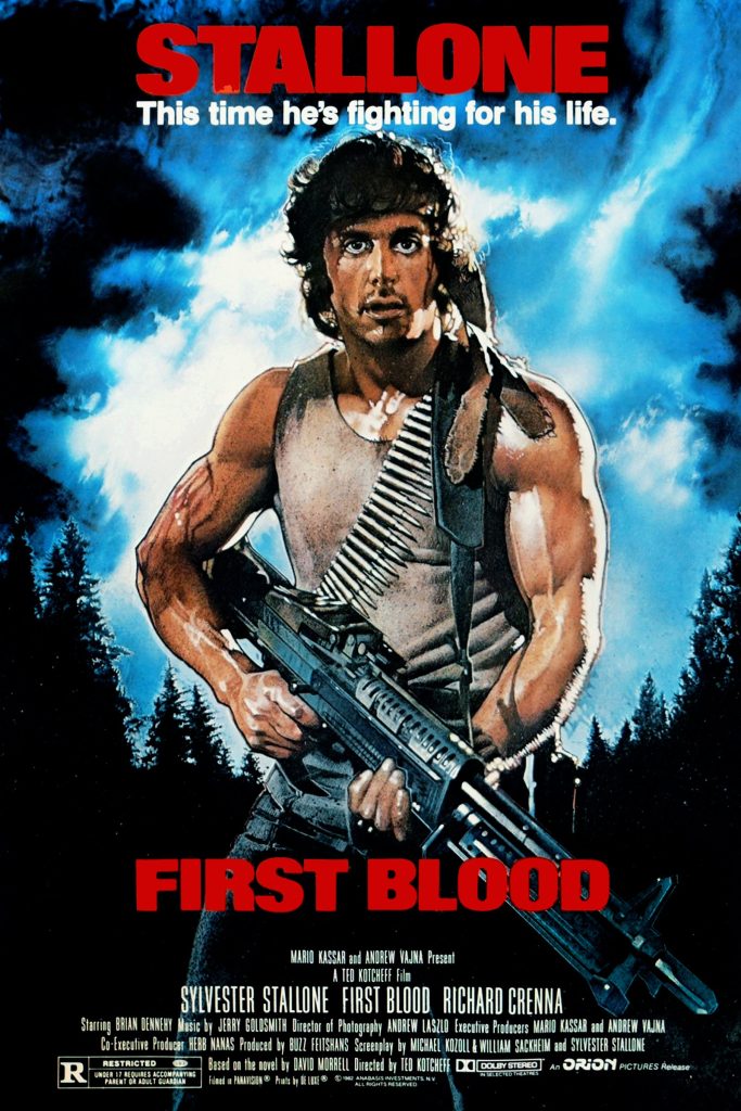
Another idea I had was to give my character a scroll or potion belt across the chest, inspired by the ammo belt worn by Rambo, to add more detail and make the character’s design more interesting to look at.
A movie poster showing the style of ammo belt I could recreate as a scroll or potion belt
Body Blockout
Before I started blocking out the body in ZBrush, I found some references to help me model. First, I looked online for a figure drawing that looked similar to the build I had in mind for my character.
I then drew out the shapes of the different body parts, to help me envision the proportions and how the anatomy fit together more easily.
Then, I found a 3D model on Sketchfab that I could use to more clearly view the anatomy at different angles, so I could more accurately sculpt the entire character.
Now that I had reference images, I opened ZBrush and modelled the initial blockout of the character.
I started with two spheres, one for the chest and one for the stomach. I used the clay buildup tool to sculpt the vague shape of the torso, then the move tool to properly shape and refine it, using the smooth stool to avoid any bumpy parts. Then, I added a cylinder above the chest for the neck, and another sphere on top of that which i shaped into the head.
I added a sphere for the shoulder, using the mirror and weld function to make it symmetrical. Then, using the IMM Primitives brush, I created a cylinder coming off of the shoulder for the upper arm, and again from the end of that cylinder from the lower arm, along with a sphere at the end to shape a hand. I used the IMM Primitives brush again to make the fingers.
For the legs, I made a series of spheres, using the mirror and weld function to ensure symmetry, and the clay buildup, move, and smooth tools for the shape.
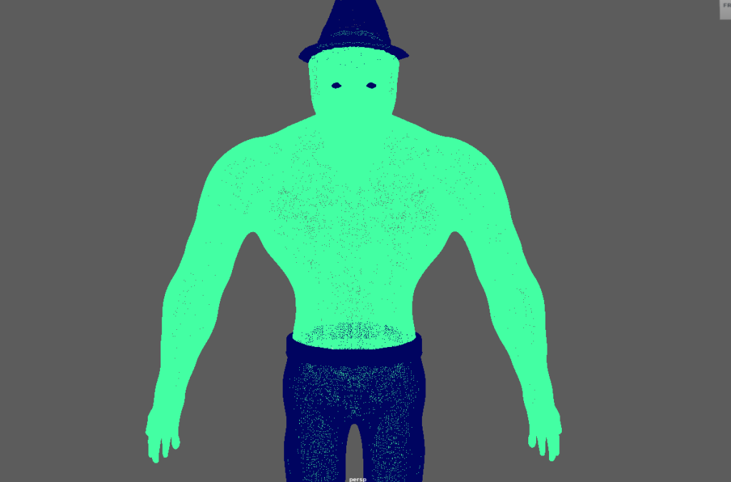
Once I had the full body shape blocked out, I combined all of the subtools into one, then used the Dynamesh and ZRemesher functions to properly combine them all into a single mesh.
Now that I had the whole body in one mesh, I began properly sculpting my character. This was almost entirely done using the clay buildup, move, and smooth tools to sculpt, shape, and refine the model into the form I wanted. I also used the dam standard brush for some small details, mostly on the face. Most of my focus was on the chest and arms, as the character would be wearing trousers and boots to cover the legs and feet, and the beard and hat would cover the majority of the face. I used the reference model I found earlier to help make sure the anatomy was as correct as I could make it, while still making some tweaks to emphasise certain parts, like making the chest and shoulders wider.
With the body sculpted, I then began work on the clothing, hair, and beard. I started with the trousers and boots – these were both created by masking of a section of the legs, then using the extrude function to create a new subtool with the same shape, but larger. I also extruded the top and bottom of the trousers an extra time to make it appear to be folded over, adding some depth and detail, and combined those extrusions with the original trousers subtool.
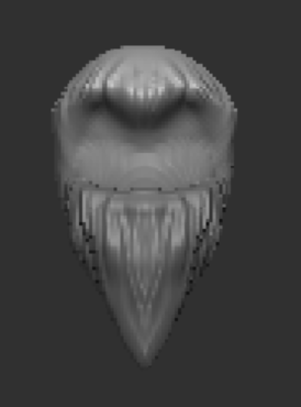
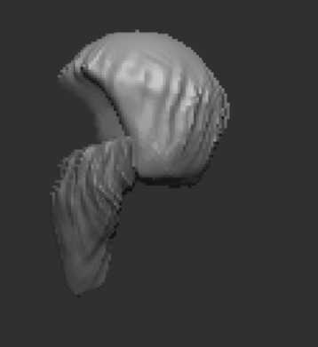
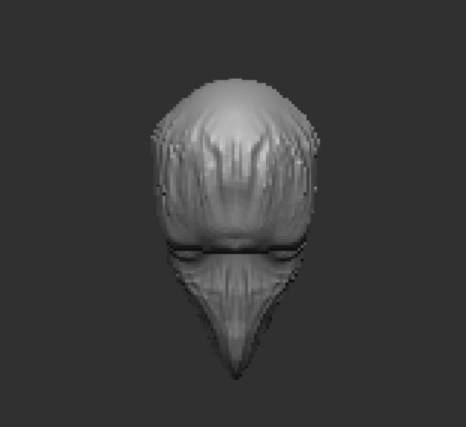
Next, I created a sphere for the hair, and another for the beard, which I sculpted into shape with the clay buildup and move tools, before using a brush I found online to create the hair texture.
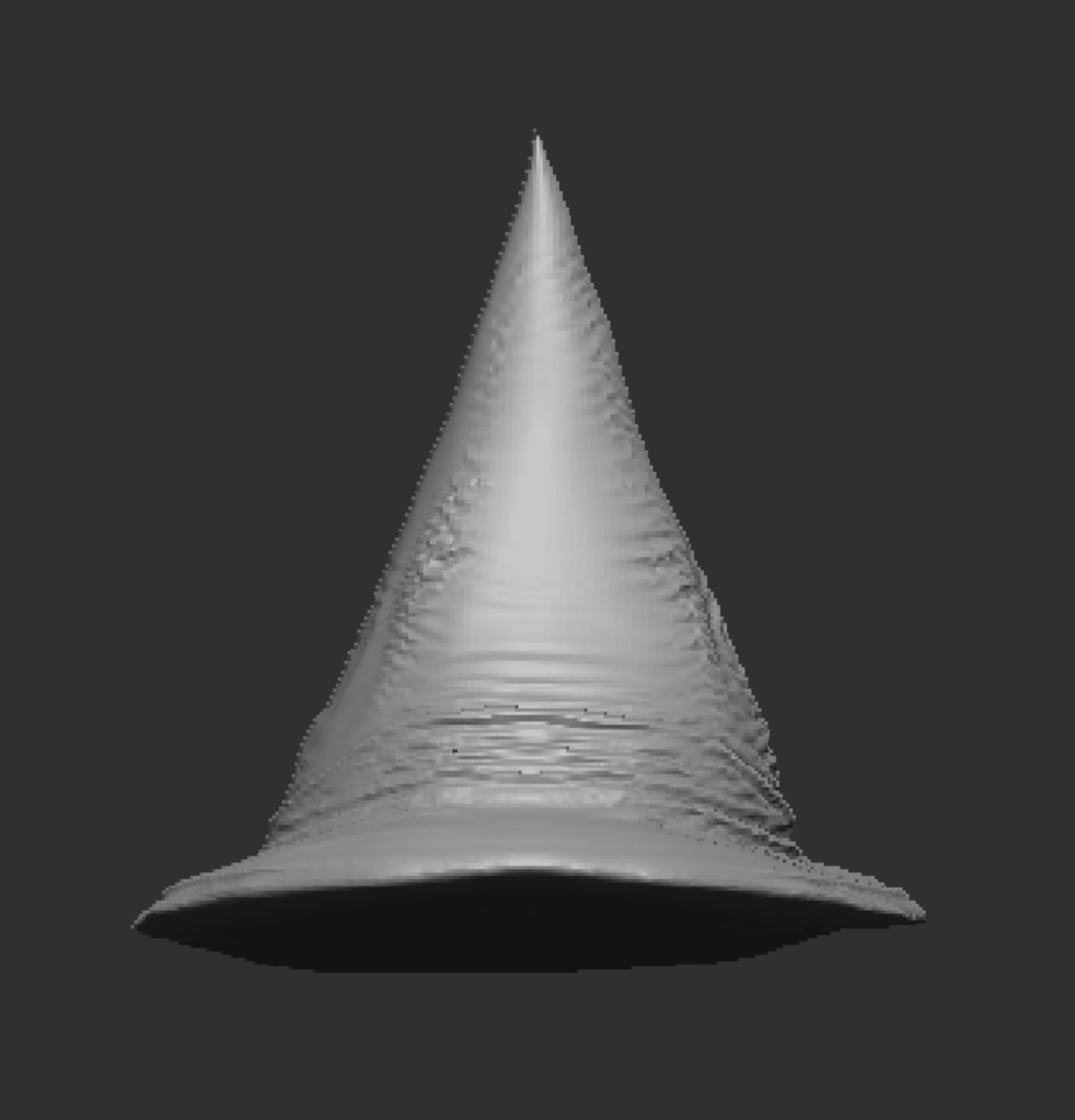
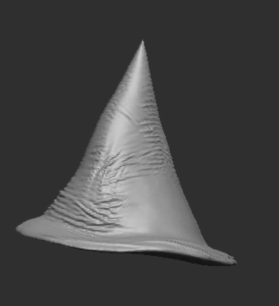
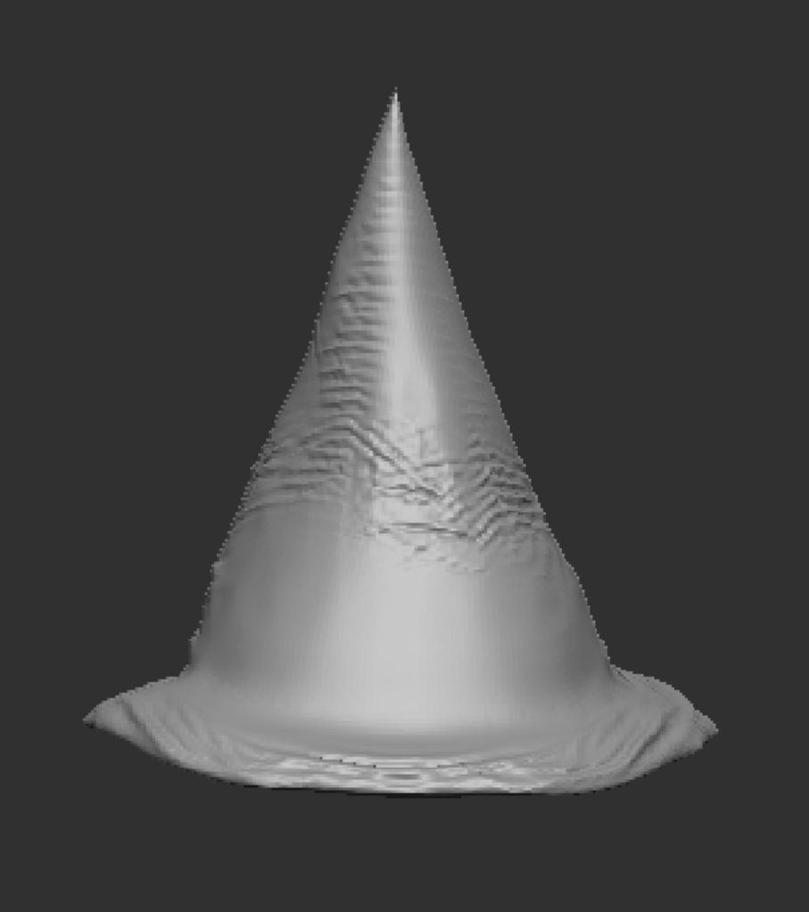
Finally, for the hat, I created two subtools – a sphere, which I flattened down to create the brim of the hat; and a cone, to form the pointy section. I combined the two subtools together, smoothed over the joint between them with the clay buildup and smooth tool, along with dynameshing, then used the cloth move tool to create some wrinkles and folds to make the hat more realistic, rather than just being a perfect smooth cone.
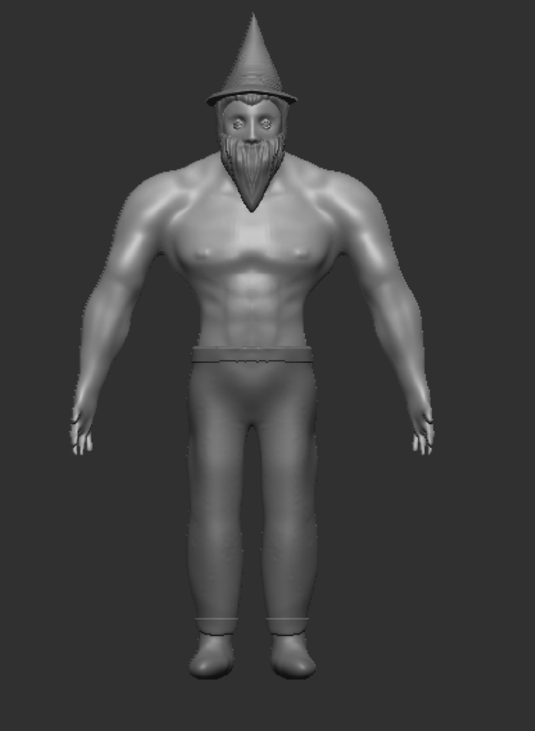
The last part to create was the eyes, which were simply a sphere sized down, moved into place, and then mirrored and welded to make it symmetrical. After combining the hair, beard, and body subtools together, I had the character model completed in ZBrush.
Maya Retopology and UV Unwrapping
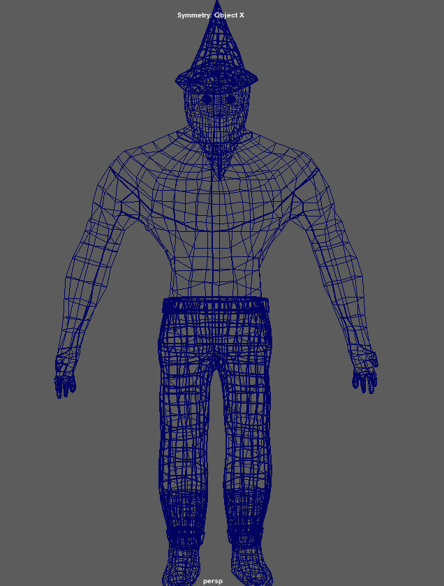
Before I exported the model from ZBrush to load into Maya, I used the decimate feature to lower the number of points, to improve its performace in maya, as too many points can cause lag. After reducing it to below 500,000 points, I exported the model from ZBrush, and loaded it into Maya to begin retopologising it, which makes the UVs much more simple and easy to unwrap, as well as keeping the poly count lower to improve performance if used in a game. Using the quad draw tool, I went around the model and created the lower poly version of the model.
The model before being retopologised – the wireframe is very complicated and high-polyThe model after being retopologised – the wireframe is much lower poly.
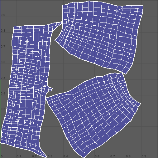
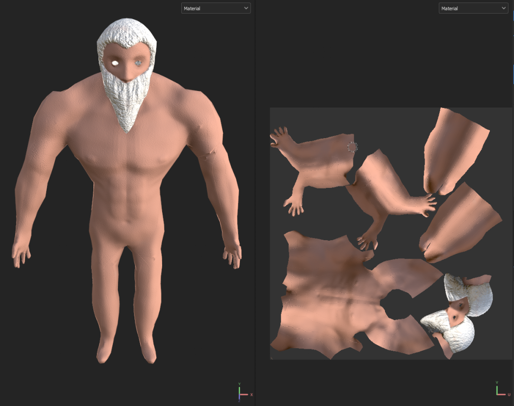
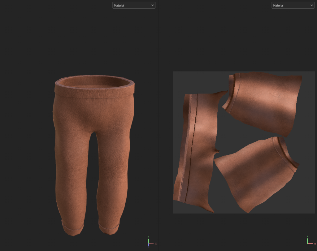
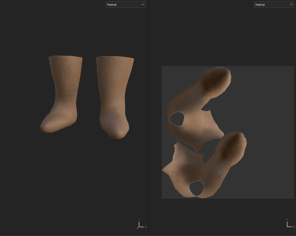
Now that I had retopologised the model, I could unwrap the UVs, which would then let me add textures to the model in Substance Painter. I used the UV Cut and Sew tool to separate the body into sections, and then added the seams that would allow the UVs to unwrap properly, for each different part of the model.
BodyBootsEyesHatTrousers
Substance Painter
With the UVs unwrapped, the next step was to create the textures. I exported each of parts of the model as both a low poly and high poly version. Then, using substance painter, I baked the high poly version onto the low poly model for each part, allowing me to have more detailed textures while still having a low poly model, improving performance.
After baking the high poly versions onto the low poly versions, I used the various different material assets in substance painter to draw the textures I wanted onto the different parts of the model.
The skin used the “Skin Human Flat” material with a high “roughness” and low “pores size” setting. The beard used the “Rock Face” material with the colour set to a very light grey.The trousers used the “Leather Skin” material.The boots used the “Leather Grain” material.The hat used the “Leather Skin” material with the colour changed to blue for the main section, and the same material with a yellow colour for the star decals.The eyes used the “Candle Wax” smart material for the base, and the “Paint Brushed” material with the colour changed to black for the pupils.
With all of these textures created, I exported them from substance painter and loaded them back into Maya to finish my model.
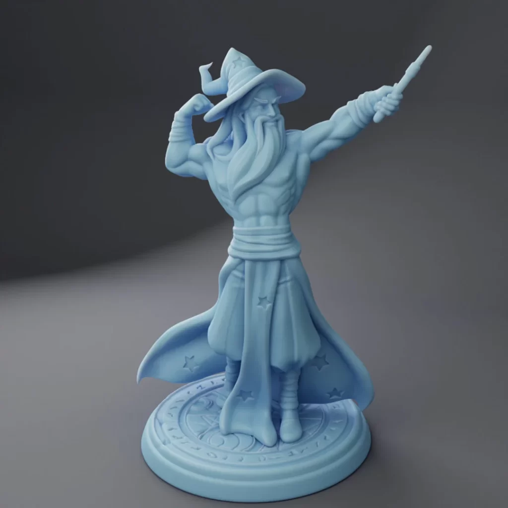
Conclusion
Overall, I think the character came out well for what it is – I unfortunately did not have enough time to create the extra accessories I wanted to add, such as the dumbell wand or the potion belt. However, I think that the major parts of the character do convey the idea and theme I was going for.
There are definitely some parts of the process that could be improved – specifically, the retopology on the arms was very blocky, which is quite clear in the final product. To improve the model, I would go back to the retopology section and put more detail into the retopology to avoid those obviously low poly segments.
Another part that could use improvement is the texturing – it came out looking quite flat and plain, which may be a result of the lighting, but improving the textures would definitely have a positive effect on the end model.
References
Pinterest. (n.d.). Image result for gandalf full body | Гэндальф, Властелин колец, Средиземье. [online] Available at: https://www.pinterest.co.uk/pin/546483736018241411/ [Accessed 23 Jan. 2024].
Who Is Albus Dumbledore (2017). Albus Dumbledore. [online] Harry Potter Wiki. Available at: https://harrypotter.fandom.com/wiki/Albus_Dumbledore.
Disney Wiki. (n.d.). Doctor Strange. [online] Available at: https://disney.fandom.com/wiki/Doctor_Strange.
Wikipedia. (2020). Wizard of Oz (character). [online] Available at: https://en.wikipedia.org/wiki/Wizard_of_Oz_(character).
Disney Wiki. (n.d.). Higitus Figitus. [online] Available at: https://disney.fandom.com/wiki/Higitus_Figitus [Accessed 23 Jan. 2024].
www.youtube.com. (n.d.). A Buff Wizard – YouTube. [online] Available at: https://www.youtube.com/c/ABuffWizard/channels?app=desktop&view=56&shelf_id=0 [Accessed 23 Jan. 2024].
www.youtube.com. (n.d.). A Buff Wizard – YouTube. [online] Available at: https://www.youtube.com/c/ABuffWizard/channels?app=desktop&view=56&shelf_id=0 [Accessed 23 Jan. 2024].
www.etsy.com. (n.d.). Buff Wizard Medium DND Twin Goddess Miniatures – Etsy UK. [online] Available at: https://www.etsy.com/uk/listing/1380130424/buff-wizard-medium-dnd-twin-goddess [Accessed 23 Jan. 2024].
Imgur (n.d.). Buff wizard will imperil you. [online] Imgur. Available at: https://imgur.com/gallery/xUJUBRH [Accessed 23 Jan. 2024].
Pinterest. (n.d.). [OC] Muscular Wizard, art by me | Concept art characters, Dark fantasy art, Fantasy wizard. [online] Available at: https://www.pinterest.co.uk/pin/796996465317240408/ [Accessed 23 Jan. 2024].
Shutterstock. (n.d.). Old Wizard Cartoon Character Cane Pointing Stock Illustration 1867291507. [online] Available at: https://www.shutterstock.com/image-illustration/old-wizard-cartoon-character-cane-pointing-1867291507 [Accessed 23 Jan. 2024].
Limited, A. (n.d.). Wizard Cartoon with Blue and Stars Clothes Character Design Mascot Vector Illustration Stock Vector Image & Art – Alamy. [online] www.alamy.com. Available at: https://www.alamy.com/stock-photo-wizard-cartoon-with-blue-and-stars-clothes-character-design-mascot-133270260.html [Accessed 23 Jan. 2024].
VectorStock. (n.d.). Old wizard cartoon character vector image on VectorStock. [online] Available at: https://www.vectorstock.com/royalty-free-vector/old-wizard-cartoon-character-vector-7120818 [Accessed 23 Jan. 2024].
Pinterest. (n.d.). Пин от пользователя Egor TBF на доске Buff | Рисунки фигур, Рисование эскизов, Рисовать. [online] Available at: https://www.pinterest.co.uk/pin/858709853948522892/ [Accessed 23 Jan. 2024].
sketchfab.com. (2022). Muscular Human Anatomy (Human base mesh) – Buy Royalty Free 3D model by Yacine BRINIS (@Yacinebrinis). [online] Available at: https://sketchfab.com/3d-models/muscular-human-anatomy-human-base-mesh-dbaef4ef1d3641f68eec4540ca50e18b [Accessed 23 Jan. 2024].
To start my design process, I began by looking through the different themes and sub-themes to try and come up with various different options for my environment. These are some of the combinations I considered:
Horror/
Fantasy/Decay – I came up with this combination for an idea for an asset, based on a magical item from a Dungeons and Dragons campaign I run, so I already have an idea of the environment around it, which is some ruins on top of a mountain.
Sci-Fi/Dystopia – This theme could be used for some kind of dictator’s office in a sci-fi world, such as the empire from Star Wars.
Sci-Fi/Decay – I thought about zombie apocalypse environment for this option, such as an abandoned building or camp.
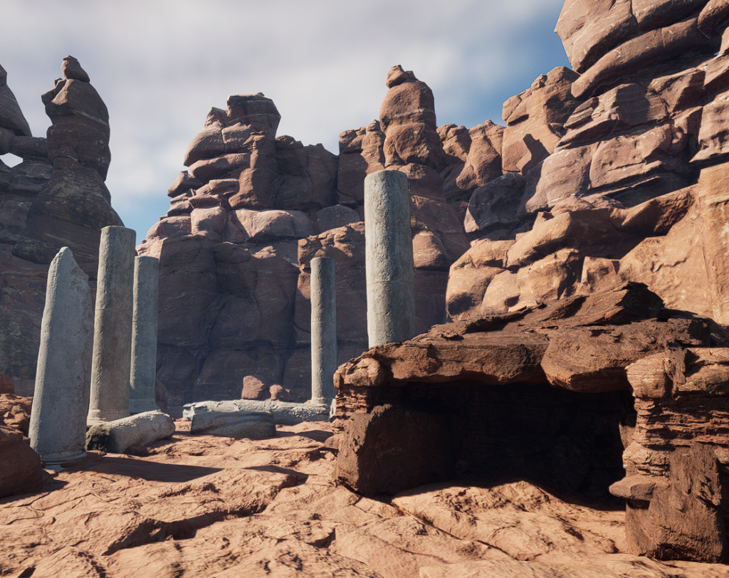
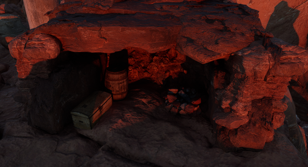
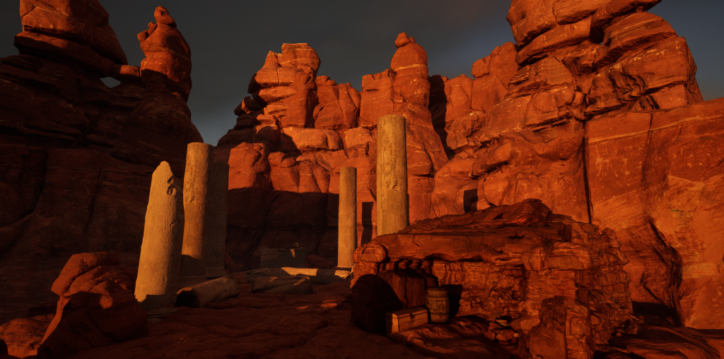
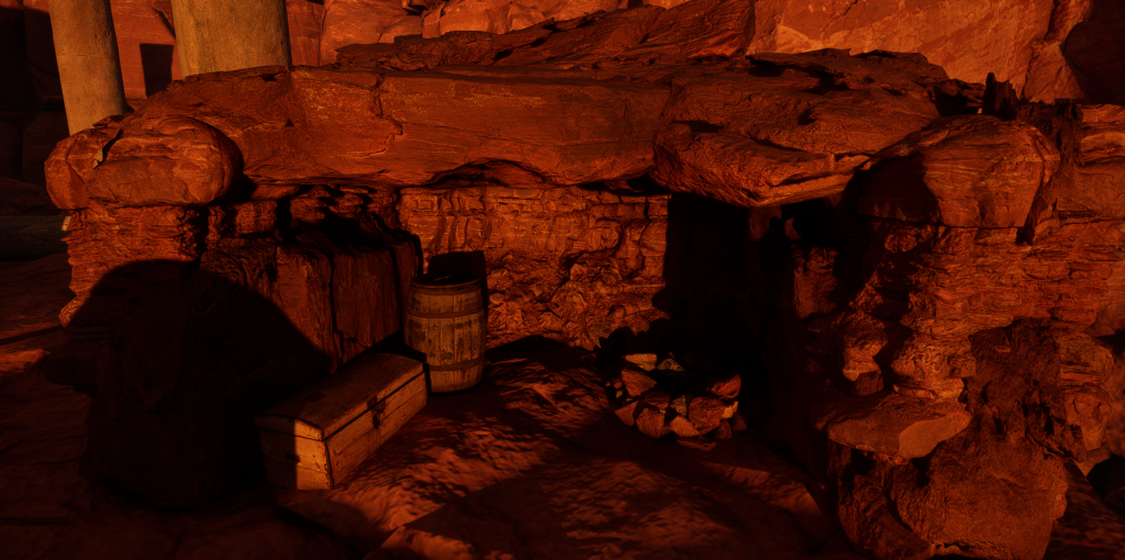
After thinking for a while about the options, I settled on the mountains and ruins for the Fantasy/Decay theme. This felt like the best option because I already know a lot about the design for it, as I came up with it for my DnD campaign – however, I would also need to add an interior area to fit the assignment, so I decided I would add a cave with a small campsite within it.
Research
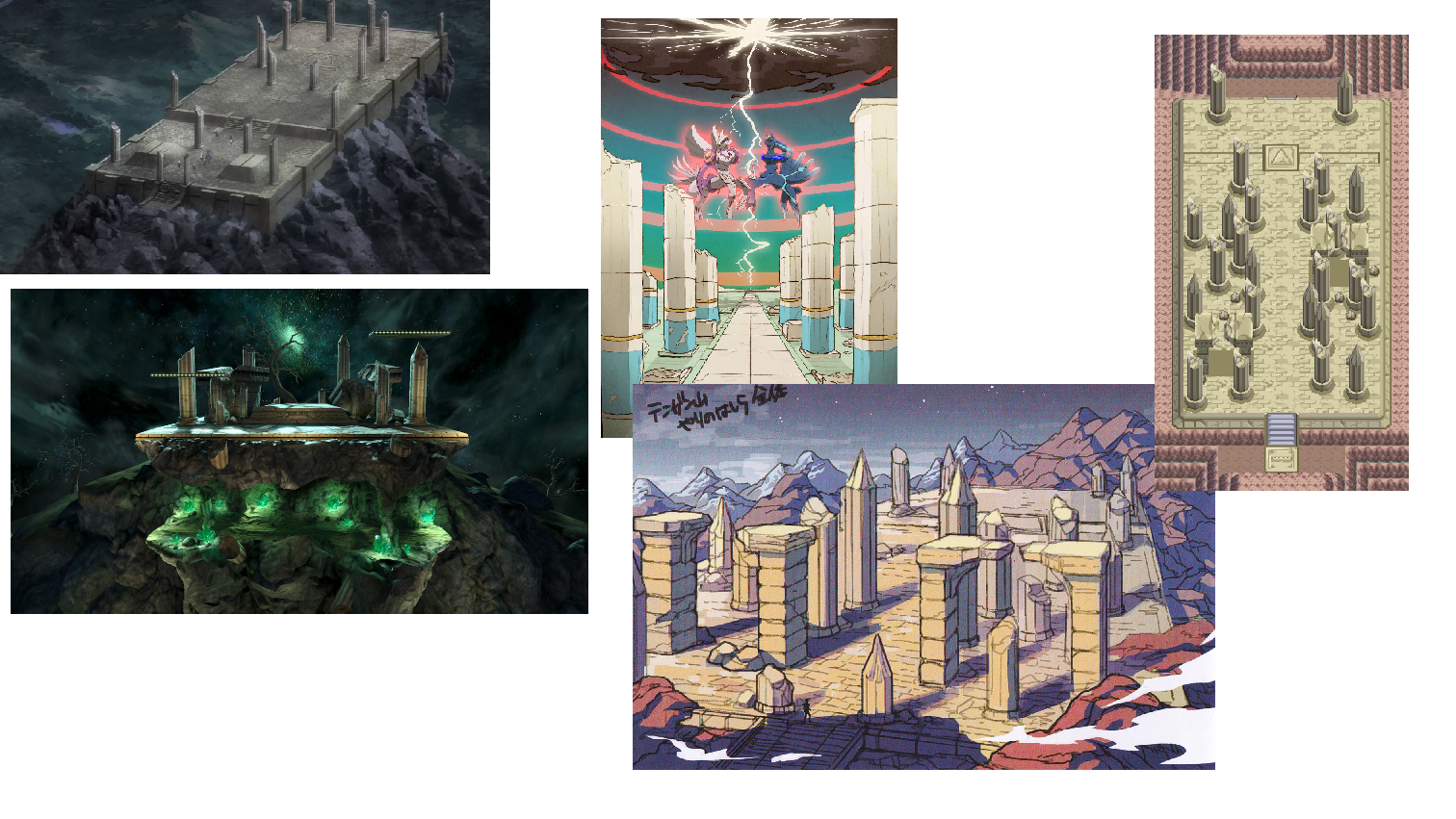
Once I’d decided on the environment I was going to be creating, I went online to search for images and ideas that could help me get a better idea of what I wanted the final piece to look like. I started by looking at images and artwork of Spear Pillar from Pokemon Diamond/Pearl/Platinum, as that is what I am planning to base the design of the ruins on.
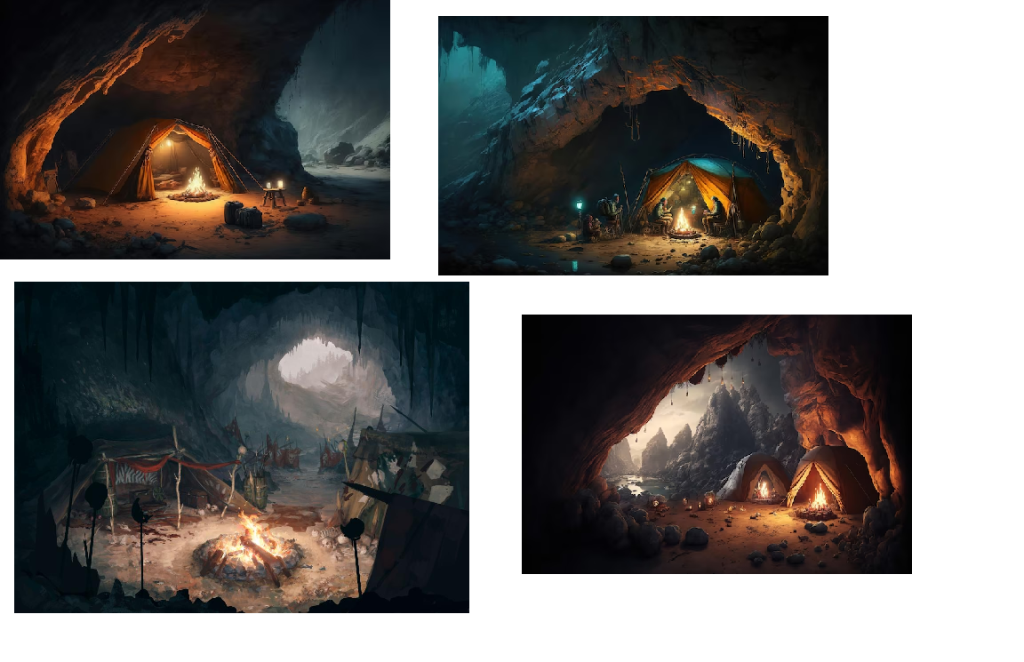
I also gathered some images of fantasy-style campsites in caves for more inspiration.
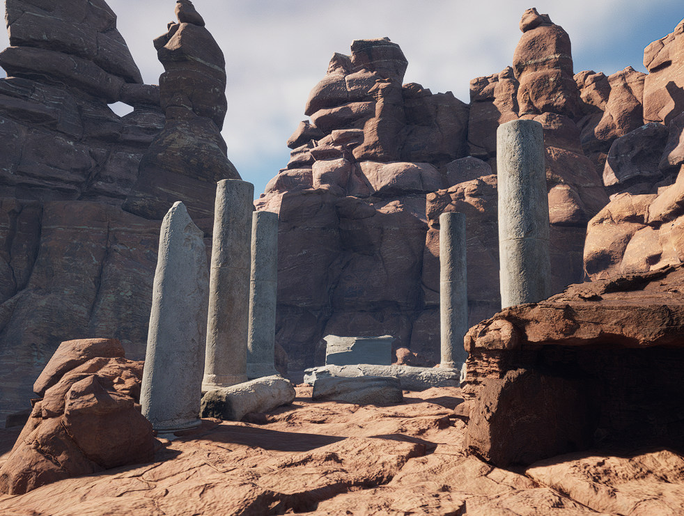
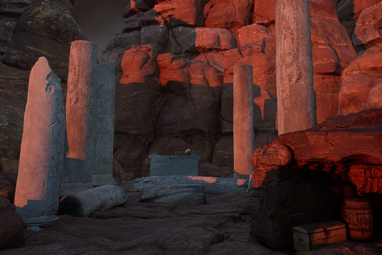
Now that I had found enough inspiration and come up with my idea, I went into Unreal to begin creating my environment. First, I created a basic landscape, adding in the different lights and visual effects needed – a directional light, a sky atmosphere, a sky light, a volumetric cloud, a exponential height fog, and a post process volume – all used to properly light the scene and ensure it doesn’t look out of place or like it’s floating in a void. Then, I created a material instance of the sandstone material in Unreal’s starter content pack, which I then modified the colour of to make it slightly redder and darker to fit the way I pictured my environment looking. After applying that to my landscape, I could begin to sculpt the shape of the mountaintop where my environment would focus on.
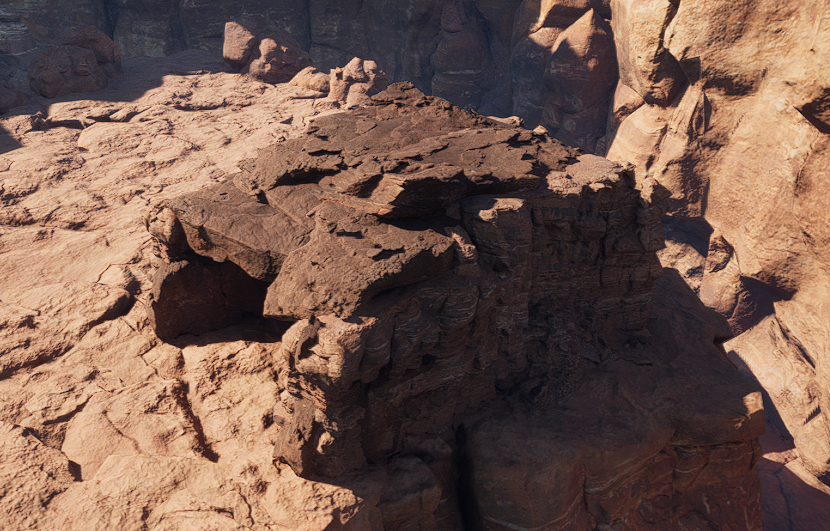
After considering for a while about how to design the environment around the focus point, I decided that the best way to do it would be to surround it with giant cliff walls, which would hide the background to cover the large flat plane below. I used Quixel Bridge to find some canyon cliff assets that would fit the style and material of the landscape, which I found in the “Canyons of Utah” section, and added them around the section I had sculpted. I only added them around three of the sides, as the way I was presenting my environment would be showing it from only the one angle, due to the layout I had planned.
Next, I worked on making the main section look more high quality, as currently it just seemed like a flat lump. Using the same canyon assets I had found on Quixel Bridge, I placed them all around the edges of the main part, as well as covering the top, extending it slightly as well, in order to make it much more detailed and interesting than just a flat platform. I also covered the flat ground below, which would likely not be visible in the majority of the environment display, but I felt it was best to at least cover it so if it was visible, it wouldn’t look out of place.
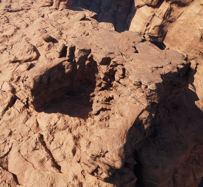
Once I was happy with the way it looked, I began to plan out where the cave would be for my interior. I felt that the section on the left of the second image would make a good place, as there was already a small rock formation that could be modified to start to make the base of a cave area.
Then I needed to find a rock asset that could be placed on top of the part I had made to make a roof for the cave. Many of the “Canyons of Utah” assets did not have a back or bottom to them, which made it a little difficult to find one that worked, but I eventually found a working asset, which I added to make the roof of the cave.
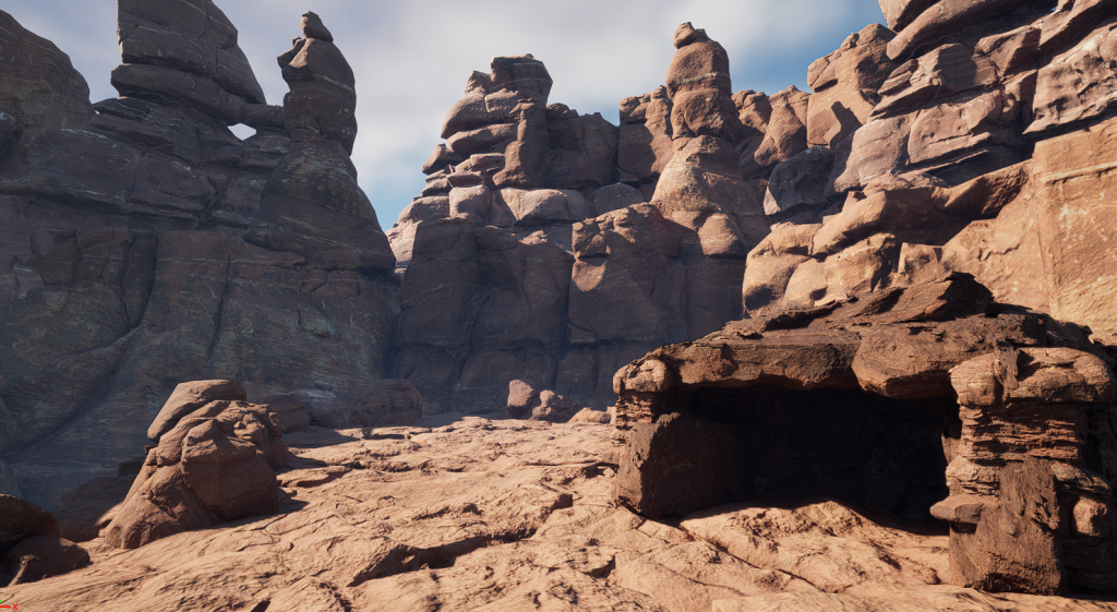
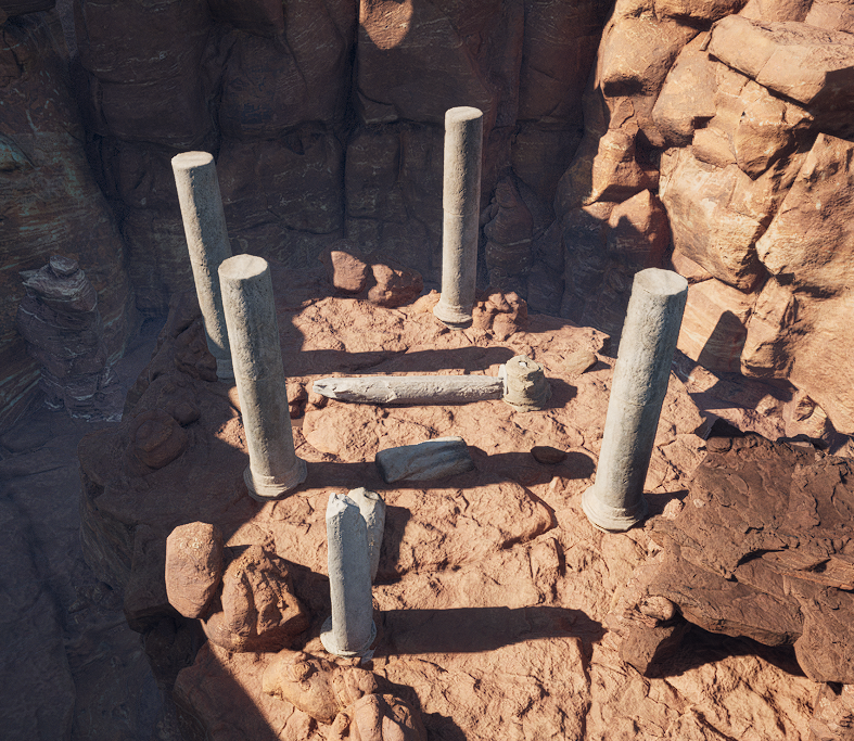
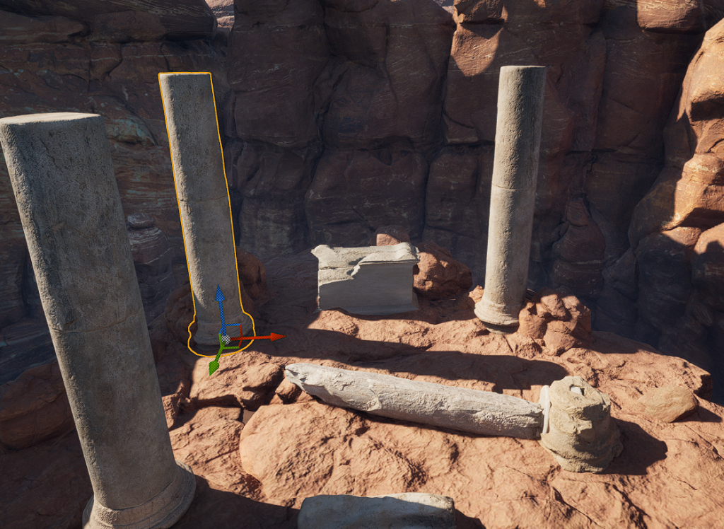
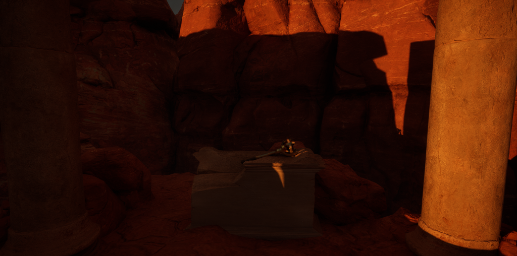
The next step I wanted to work on was the ruins, as they would be the main focus of the environment, so it was important to get them right. I started with the pillars, using Quixel Bridge assets from the “Roman Empire” section, making two of them broken to emphasise the decay aspect of the environment. The pillars themselves are a different style and stone to the environment around them, which is intended – I wanted them to seem out-of-place to make the viewer wonder where they had come from and why they were there.
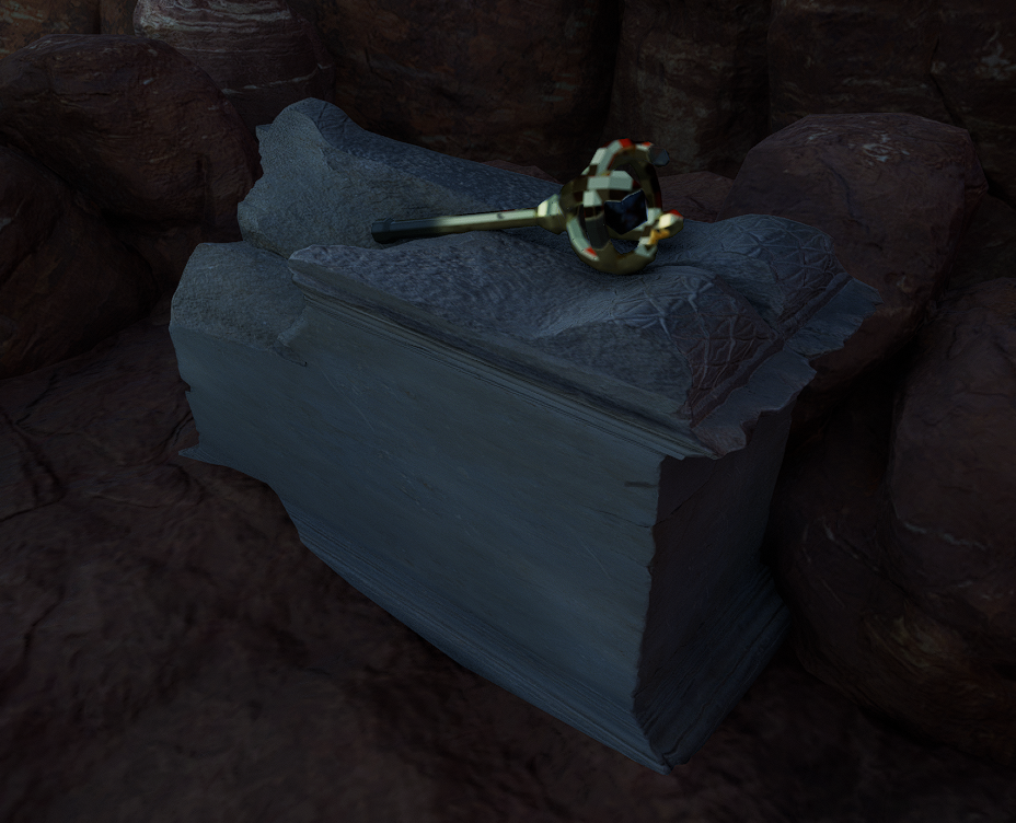
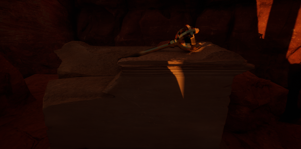
Once I was happy with the pillars, I then found a plinth, similarly from the “Roman Empire” section to fit in with the pillars, which would hold my asset I had designed previously.
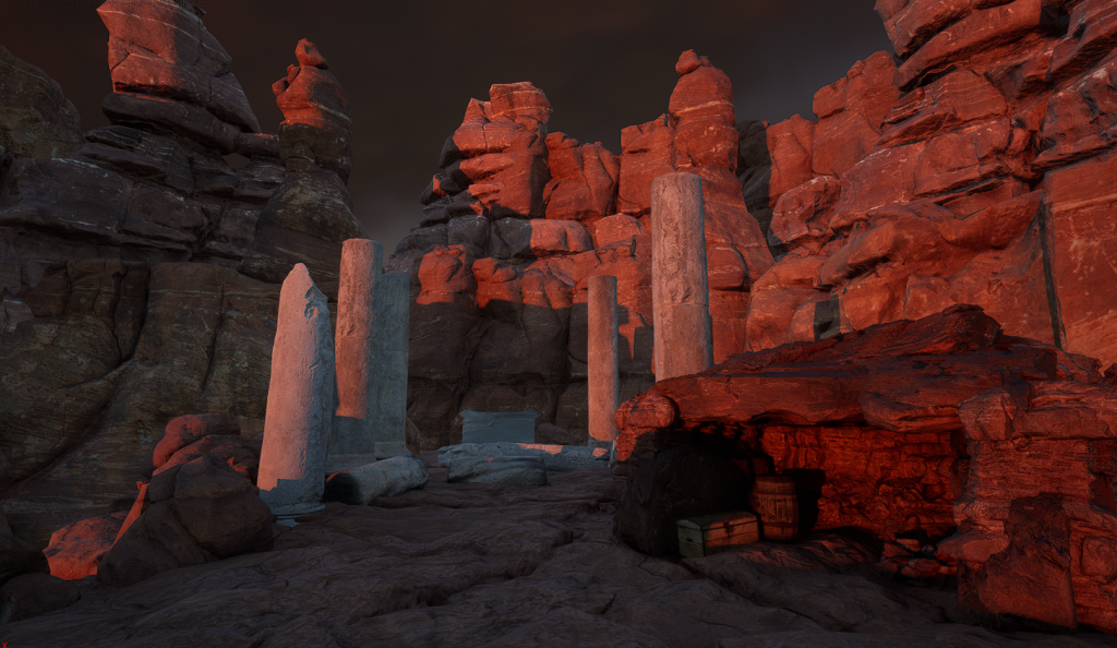
The last things to add were the campsite, and my scepter asset. I started with the campsite. Instead of making it exactly like the example assets I used, I wanted it to seem empty and old, once again showing the decay theme. I added an unlit campfire, and some storage objects to show that it had once been used, but no bedroll or similar things so it seemed more empty and not lived in. I also adjusted the directional light to make the light shine into the cave, and also appear to be more of a sunrise or sunset, making the whole scene darker and adding a reddish glow to add to the atmosphere.
Finally, I added in the scepter asset. I imported it from Maya, applied the materials, and placed it onto the plinth I made earlier.
All that was left was to make some finishing touches to the lighting to get the tone and atmosphere to be as good as it could be, and with that my environment was complete.
To start my design process, I began by looking through the different themes and sub-themes to try and come up with various different options for my final asset. These are some of the combinations I considered:
Horror/Corruption – I thought about the idea of a kind of parasite monster, but quickly realized that modelling a creature like that would be much more difficult than I could likely manage.
Horror/Beauty – An evil or dangerous plant/flower could have been an interesting option
Fantasy/Alien – This could be chosen for something like an Aberration from Dungeons and Dragons, like a Beholder or a Mindflayer, but any of those seemed much to complex and confusing to attempt to model.
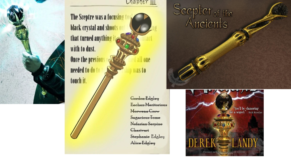
Fantasy/Decay – Also inspired by Dungeons and Dragons, I had the idea to create a destructive scepter that is a magical item in a DnD campaign I run.
Sci-Fi/Alien – While this seems like an obvious choice, I could not think of any particularly interesting or exciting to do with this theme.
Sci-Fi/Decay – This made me think of some kind of zombie apocalypse setting, but I couldn’t come up with a good specific asset to create for that.
After thinking for a while about the options, I settled on the scepter for the Fantasy/Decay theme. This felt like the best option because I already know a lot about the design for it, as I created the item for my DnD campaign, and it is both simple enough to model with relative ease while still being complex enough to be an interesting design.
Research
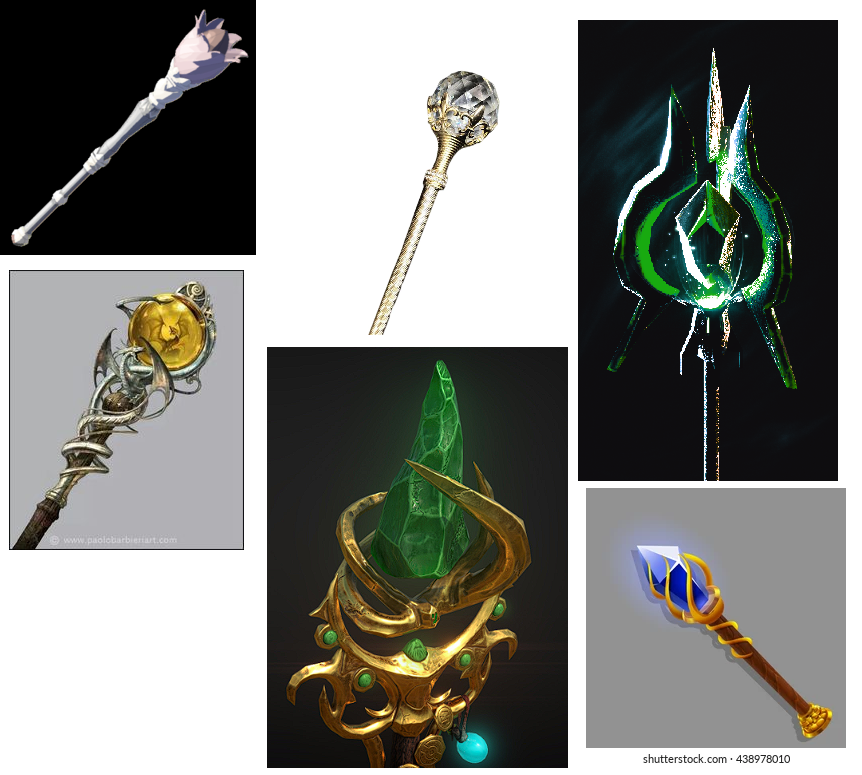
Once I’d decided on the asset I was going to make, I began looking for images online to use for inspiration and ideas. The scepter itself was originally based on the Scepter of the Ancients from the Skulduggery Pleasant book series – a golden scepter with a black crystal at the top, which could create destructive black lightning, so I started by finding some official and fan-made art of that scepter.
I then also found some other images of scepters for other potential designs of the shape and form of my asset.
Design
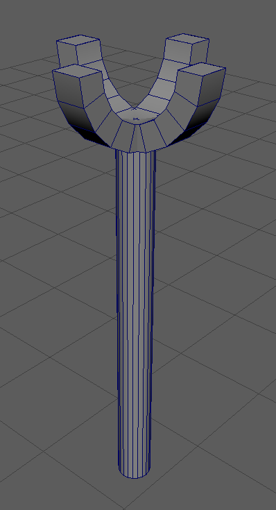
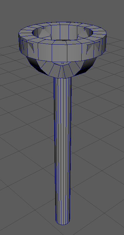
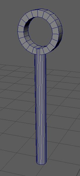
The next step was designing the basic shape of the design I was going to go with. I experimented with a few different designs before settling on the one I would go with.
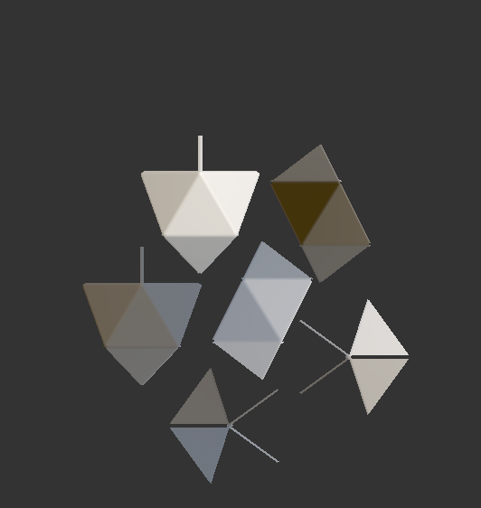
I decided on the last design, where the crystal would sit in the center of the top segment. Next, for the crystal, I decided that because it is based on my DnD campaign, I would use the shape of a d20 dice. I then began to work on the final asset.
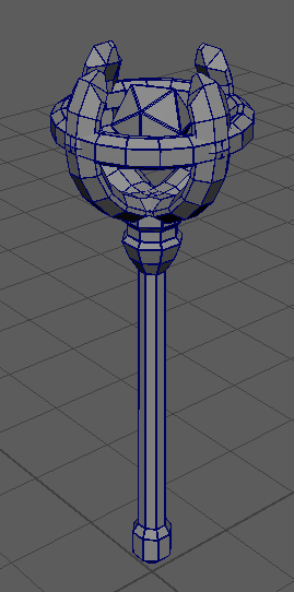
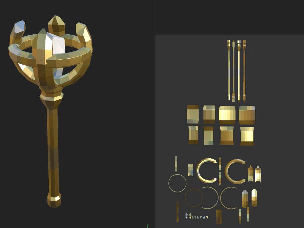
Creation
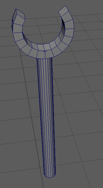
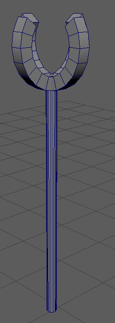
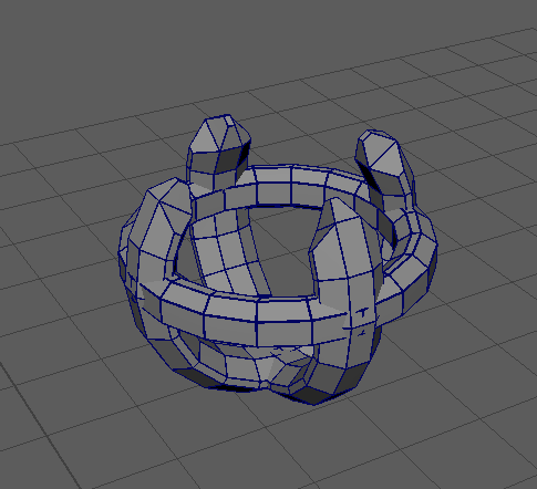
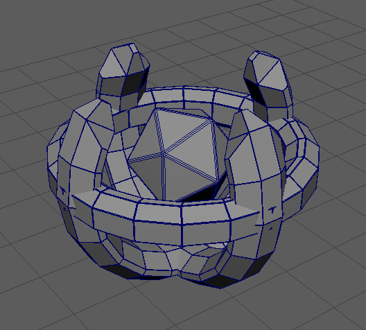
First, I worked on creating the top of the scepter, which would hold the floating crystal. I used the premade “Pipe” shape to create a hollow cylindrical shape, cut a section of the top of the ring out using the face selection tool, filled in the hole using the “Fill Holes” tool under the Mesh category, then used the “Extrude” and “Bevel” tools to flesh out the shape. Once I was happy with it, I duplicated the shape I had created and rotated it 90 degrees to create the other two arms of the crystal holder.
Next, I created another “Pipe” shape, which I resized and similarly extruded and bevelled, which I placed around the center of the arms to create a ring around them.
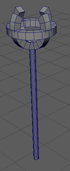
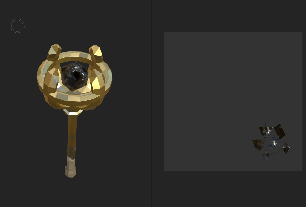
Next, I added the crystal using the object creation tool by selecting the “Platonic Solid” for the shape, and bevelled it to make it fit more with the rest of the asset.
The last part to add was the handle. I made this out of one cylinder, using the extrude tool to expand it downwards as well as the bevel tool to make more segments, then bevelling again at the end to once again make it fit the rest.
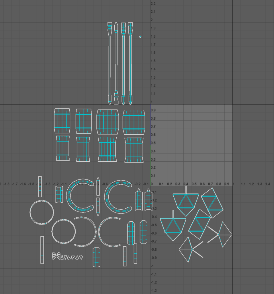
Next I needed to add textures and colour to the asset. To start with, I sorted the UV’s of the asset so I would be able to see them when exported into substance painter.
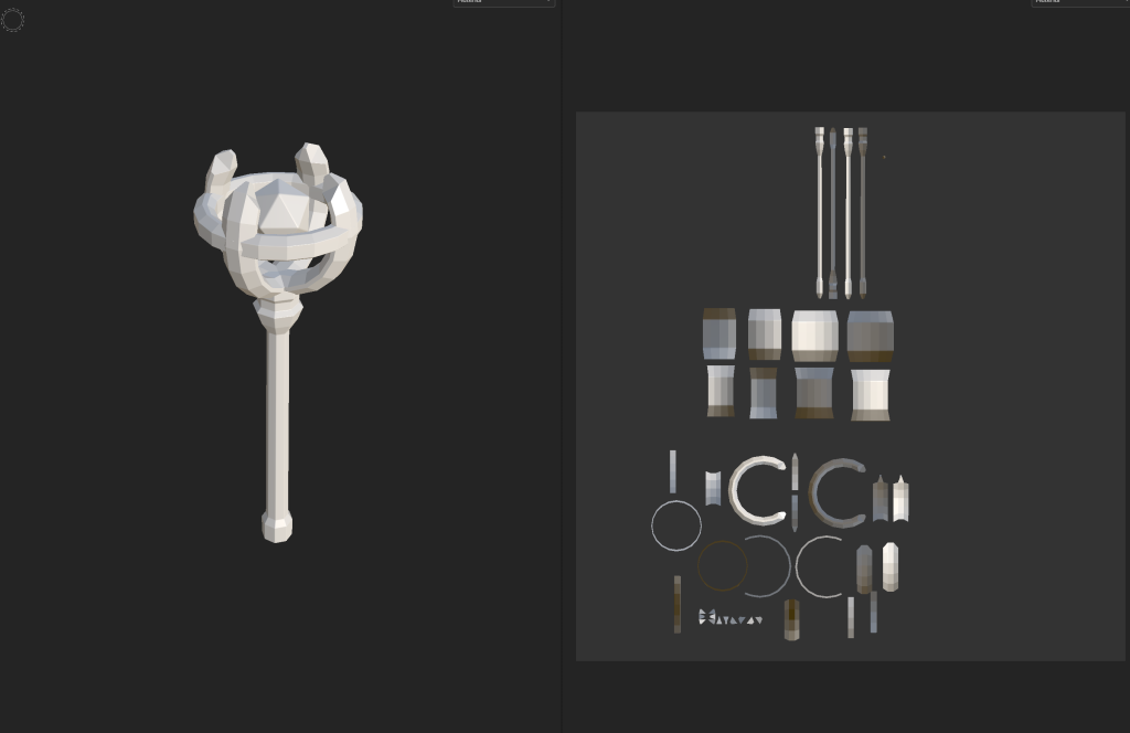
Then I imported the asset into substance painter, where I began to paint the asset.
The UVs for the main scepter in substance painter.The UVs for the crystal in substance painter.
I started by painting the main part of the scepter with the gold texture, then added some patches of the brass and coated metal textures to add variety and make it seem slightly more old and worn-down.
I then painted the crystal with the carbon fiber material, but made it slightly transparent to make it seem more like a crystal rather than just a floating object.
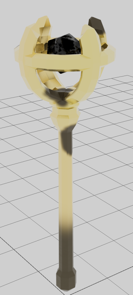
Then I exported the texture back into Maya and applied the materials to the scepter.
Finally, I worked on animating the scepter for the final display video. I made it rotate around slowly to show the entire thing, and made the crystal within slowly move up and down while rotating slightly faster. The transparency of the crystal did not seem to show up in the video, but it did not affect the overall appearance very much, and looked good enough that I did not feel like it needed to be changed.